

 Rapid Ext JS (beta)
 ReExt
ReExt


Accessibility: The Keyboard is Your Friend
February 5, 2015
107 Views
Introduction
 The term “accessibility” is very broad and can be intimidating when first encountered. Often, this encounter comes from new business requirements. That is, developers have to make an existing application accessible. There are many aspects to consider for accessibility, such as Assistive Technologies and standards. Many free assistive technology products are available, but learning how to use them and understanding what to expect from them takes time.
While becoming familiar with these issues (and the design challenges they present) is a good thing, there is one vitally important area of accessibility that has no such barrier: keyboard interaction. Keyboard management alone is seldom a sufficient level of accessibility for an application, but it will always be a minimum requirement, as stated in the Working Draft on ARIA Practices:
It is very important that that your widget be keyboard accessible. In fact, there must be a keyboard equivalent for every mouse operation in your application.
If done properly, keyboard management is also beneficial to users without disabilities. Your power users will benefit from the ability to navigate your application with a few keystrokes instead of constantly switching back and forth between keyboard, mouse, and touch screen.
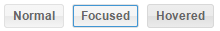
Focus
The concept of focus, while not new, is the cornerstone of keyboard management. What is perhaps new, or at least not entirely obvious, is just how important focus is to users:
A tenet of keyboard accessibility is reliable, persistent indication of focus. The author is responsible, in the scripts, for maintaining visual and programmatic focus and observing accessible behavior rules. Screen readers and keyboard-only users rely on focus to operate rich internet applications with the keyboard. [W3C Working Draft ARIA Practices]
With Ext JS 5.0.1, we added the necessary styling to the core components that support this requirement. We additionally provided Sass variables to allow themes to easily adjust the presentation of focus.
Keyboard Input
The concept of focus is all about keyboard input. When the user types on the keyboard, the key presses are directed to the currently focused element. This may be an obvious thing like an input element, but is not limited to such elements. For example, if a div element is assigned a tabIndex and then gets the focus, keyboard events will be delivered to that element. Unlike the input element, however, there is no default action associated with these events.
Focusability
It makes sense for many components to receive focus. The focusable property of Ext.Component indicates that the component is able to receive focus. This is typically due to the DOM associated with the component (such as the input element of a TextField).
A component’s ability to receive focus is determined by the DOM it produces upon render. Many elements are naturally able to receive focus (such as an anchor or input element). Elements that do not receive focus by default can use the tabIndex attribute.
When a component has an appropriate DOM structure, it should set the focusable class property to true. This instructs the component to listen for focus and blur events. Because a component can contain many elements, such components may also need to implement the getFocusEl method in order to return a reference to the component’s focusable element. This is the primary element by default.
Changing Focus
Focus can move between elements due to mouse clicks or key presses. When a mousedown event occurs on a focusable element, the browser’s default action is to give it the focus. The keyboard, however, provides multiple ways to change focus.
The primary means of changing focus via keyboard is the TAB key (optionally modified by SHIFT). The TAB key moves the focus to the “next” tabbable element. If SHIFT is also pressed, focus instead moves to the “previous” tabbable element. Notice that the word used here is tabbable and not focusable. Some elements may be focusable programmatically or via mousedown events, but are not reachable by the TAB key.
In some cases, the standard requires the use of the arrow keys (LEFT, RIGHT, UP and DOWN) to navigate between child items. This is the case in special containers such as toolbars and menus, but more on those later.
Consequences of Changing Focus
When focus changes, many important side effects come into play. The most obvious are aesthetic, but there are others:
- Binding – Valid input values with two-way bindings are written back.
- Collapsing – ComboBoxes and other picker fields may have a floating picker to hide.
- Delegation – When some components receive focus, they immediately transfer (delegate) the focus to another. For example, see the defaultFocus config.
- Editing – When used in editors (such as grid cell editors), fields write back their value when losing focus.
- Validation – Input validation is performed when leaving the field.
Most of these actions are directed at the component that is losing the focus. In DOM terms, that is the component that is being blurred.
Blur Grows Up
In previous versions of Ext JS, the blur event was indeed the event that triggered the aforementioned side effects. In many cases, however, the blur event was not well suited to the task and the framework had to compensate. This was partially due to the fact that focus and blur events do not bubble. The only way to process these events for multiple elements is to add listeners for both events to each and every element. More problematic than bubbling is the fact that Firefox has never properly reported the relatedTarget for these events.
The DOM standards are evolving to correct for this inadequacy by way of the new focusin and focusout events. These events are not universally supported, and even if they were, they would not account for floating components (such as a menu owned by a button). What is needed are events that bubble like focusin and focusout, but also understand the Ext JS component hierarchy.
focusenter and focusleave
These new component events, focusenter and focusleave, are designed to solve these issues. To see them in action, let’s look at this demo:
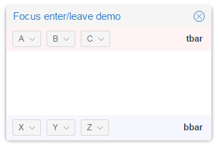
We have a component hierarchy like this:
- window
- tbar
- A (button)
- B (button)
- C (button)
- tbar
-
- bbar
- X (button)
- Y (button)
- Z (button)
- bbar
As we interact with the buttons, we can see the events in the console:
1. Click button A
–> enter A from ext-element-1
–> enter tbar from ext-element-1
–> enter window from ext-element-1
2. Press RIGHT arrow (focus moves to B)
enter B from A
3. Press TAB (focus moves to X)
enter X from B
–> enter bbar from B
In step 1, we see the focusenter event arrive at button A, then bubble up to the tbar, and finally the window. The navigation to button B is inside the tbar so these events do not reach the tbar or the window (since focus is not entering or leaving them). Finally, when we TAB to button X, the focus does leave the tbar and enter the bbar, but remains inside the window component.
The demo also assigns menus to the buttons. If you open these menus and focus the menu items, you will see that they are treated as children of their owning button. This is true even though the menu elements are rendered to the document body and thus are outside of the DOM hierarchy for the button.
The messages may differ slightly on the first pass versus repeating the steps due to focus delegation of toolbars, but the key thing to note with these events is that they will always supply the “related” component.
onFocusEnter and onFocusLeave
These new component methods are called when focus enters or leaves the component. If you have custom components or views that contain logic in response to focus or blur, you may want to consider moving that logic to these methods. Processing focus and blur is still supported of course, and even useful in some cases. However, if you need to create child components, and especially if they are floating components, then these new methods will likely provide more appropriate timing.
Focus and Containers
Most of the time, users press TAB and SHIFT+TAB to navigate between components. In some cases, however, the standards require the use of LEFT, RIGHT, UP and DOWN arrow keys. For example, in containers such as Menus, Toolbars and RadioGroups, you are expected to enter and exit via a single TAB key press. This helps users navigate the page more quickly and not get bogged down by tabbing through a potentially large set of toolbar buttons.
Ext JS provides this support in the FocusableContainer mixin. This mixin also tracks the previously focused item and restores it when focus returns. To ensure that TAB properly departs the container and that focus is restored on return, this mixin manages the tabIndex of its child items.
Staying Focused
It is extremely important to maintain the focus consistently, and provide logical focus transitions to ensure a productive workflow. For example, when opening a new form it is advisable to place focus on the first input field, so the user could start typing right away without having to navigate to that field.
There are other times when focus needs to be set programmatically, e.g. when using Ext.Msg to display a Yes/No prompt. Whenever this kind of intervention is required, it is important to also restore the focus to its previous location whenever possible. While there is logic in the Window class to assist with restoring the focus, if you need to manipulate the focus, don’t forget that you may need to undo the process.
Masking
Masking is another situation in which focus must be manipulated with care. For example, if a panel has a button that causes an AJAX request to the server, it is often appropriate to mask the panel to prevent further button presses until the request completes. The masking element alone is sufficient to prevent mouse clicks, but to block keyboard access to the panel’s content, more is required.
When the mask is shown, all of the child items are temporarily made untabbable (by setting tabIndex to -1). In addition, if the focus was inside the masked component, the focus is moved to the mask. Assuming the previously focused item is still around when the mask is removed, focus is restored to said item. Child item tabbability is also restored.
Conclusion
With all the attention we pay to touch interfaces today, it is easy to get the impression that touch has replaced all previous interfaces. Developers aren’t the only people still using the keyboard. Our users depend on it as much as we do. If our apps can be driven from the keyboard, we give our users the productivity and efficiency they want. We also open the door for people with disabilities.
The best part is that you can always tell how well things are going: just count the number of times you have to reach for the mouse or touch the screen to get a task done.
Did you find the content helpful?
 0
0

 0
0

Latest Content

Highlights of Virtual JS Days 2024
Highlights of Virtual JS Days 2024 From February 20-22, 2024, we held the third Virtual…
March 12, 2024

From the GM’s Desk 2023: An Exciting Year for Sencha & Ext JS 7.7
We are past the midpoint of 2023 and we are very proud of what we…
August 11, 2023

Sencha MVP Spotlight: Animap - The Historical Research Tool with Andy Allord
Welcome to our Developer Spotlight Series, where we showcase the remarkable talents and achievements of…
August 2, 2023