

 Rapid Ext JS (beta)
 ReExt
ReExt


Re-skinning Your Apps Just Got Easier with Sencha Architect 3
December 5, 2013
105 Views

There are many reasons why you might want to change the look of your app. That’s why we came up with the Themes feature in Sencha Architect 3. Theming was one of the most requested features, and I’m proud to be one of the people who worked on adding it to Architect 3.
In this blog post, we will give you a quick run through of the Themes feature and share a few tips. You’ll also learn how to export a theme built in Architect, so you can use it with other Sencha Touch and Ext JS projects.
To learn more, sign up for the Architect 3 webcast on Thursday, 12/12 at 9-10am PST.
The New Themes Feature in Architect 3
Sencha Touch and Ext JS themes are built using Sass. Sass uses the same syntax as SCSS, and it makes working with themes more efficient than CSS. Ext JS and Touch themes consist of rules that form the base for all the components to display correctly across different browsers. You can change the look of UI components by editing these rules and variables.
Theming Basics
Theory
Theming can mean a lot of different things, from simple tweaks to a complete visual overhaul. To make global changes to components, you modify variables in the base components which are then inherited by other components down the line. You can make localized changes by applying styles to component instances or creating custom Sass rules.
Variables can inherit values from each other. You can reference component variables in your custom Sass.
Take a look at the diagram below for a visual representation of how variables and custom Sass work together.
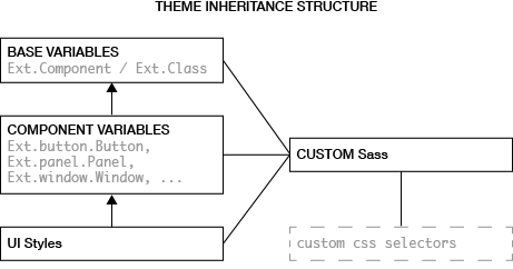
Tip: It is possible to modify or create new inheritance structures in variables. To create a new inheritance, right click a variable to copy its Sass reference, and paste it to another variable. Avoid circular references because your code will not compile.
Let’s theme!
The best way to customize themes is to take a top-down approach. Start by defining global settings and variables, and then get more specific as you go along. This should make your code easier to understand and maintain.
As you get deeper into the component hierarchy, you’ll notice inheritance and dependencies on higher classes increases. Take a look at the screenshots below, to get a better idea of what this means.
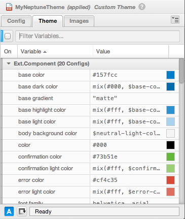
button default background color -> button default base color -> base color).
Top level theming is done through global or base variables. These variables are listed under Ext.Component for Ext JS and Ext.Class for Touch. These variables do not change the styling directly. Instead, they are inherited by most of the other variables. For example, in the Touch Default theme, you’ll find variables like ‘base color’ or ‘font family’ that directly affect a component or UI style variables. And in some cases, they’ll indrectly affect them, so you need to be careful.
Tip: Always try to keep the number of variables you are modifying to a minimum. If you are modifying a lot of component variables, check to see if there is a base variable that corresponds to all of them first.
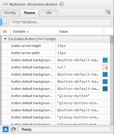
Component variables offer more detailed configuration options. Typically, you only change these variables if you are making major changes to the visual appearance of a theme. Keep in mind, changes to component variables will change the look of all the instances of the same component. Proceed with caution — a lot of component variables inherit from base variables or other component variables.
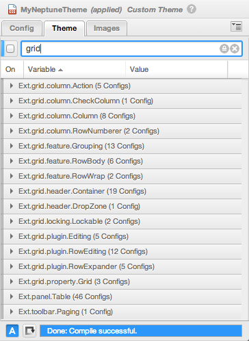
Some UI components can be fairly complex, such as Grid Panel (Ext.grid.Panel). Its appearance depends on variables defined in 15 different classes. That’s because Grid Panel is the combination of multiple components including a panel, columns, rows, editable cells, a grid, grouping headers, etc. You should also be aware that not all relevant component variables are listed when you select a component. When that happens, select the entire theme and search for the variables there. For example, if you’re using Grid Panel, searching for ‘grid’ will find all the variables you need to configure it.
Take a look at the following screenshot to see a list of variable groups containing grid related variables.
Tip: When creating inheritances, avoid having the style of one component depend on the style of another component. As a rule of thumb, keep inheritance structure within the component or from base variables to component variables.
Tip: Almost all component variables have a prefix relevant to the component they affect. This makes searching much easier.
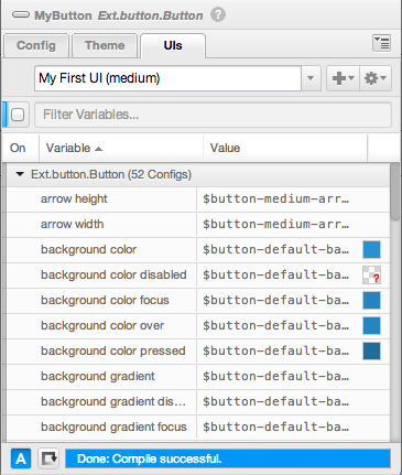
You may want to create a view containing several components of the same type but have them look different (for example, a green ‘OK’ and a red ‘Cancel’ buttons). For this simple case, just apply a UI style to a single instance to modify how the component looks. You’ll find most of the default themes have predefined UI styles for commonly used components. However, when none of these suits your needs, you will want to create a custom UI style that you can configure and apply to a specific component.
Tip: Before creating a UI style, check to see if there is a default one that meets your requirements.
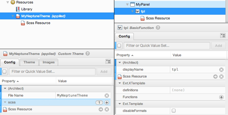
Sooner or later, you may find there are things you want to change about a component for your app, but the variable for the UI style doesn’t exist. Fortunately, you can create it with a custom Sass resource that you attach to a theme. This custom Sass resource will always be linked to the theme. If you reuse the theme in another project, the linked Sass resource will come with it. Below are the two objects that allow linked Sass — theme and template resources.
Here are a couple of more tips that will make it easy for you to customize the look of your components.
Tip: The colorpicker is available when editing the custom Sass resource. To preview a color from the code, select the hex-code or any other type of color code and click on the colorpicker button — the color from the code will be selected.
Tip: Automatic compiling can be toggled on and off. It’s useful to turn it off if you’re making a lot of subsequent changes (for example, editing a Sass resource) in order to prevent unnecessary compiling.
Advanced Practices
Selecting a theme
When you create a new theme in Architect, it will always be an extension of a basic Ext JS or Touch theme. The underlying principles for creating Ext JS and Sencha Touch themes is the same. However, there are differences in how they were implemented. This is important to keep in mind because Ext JS and Sencha Touch themes are not interchangeable.
You can create your own themes based on any of the available themes in the Ext JS and Sencha Touch frameworks. If you want to radically change the look and feel of your app, consider using the Neptune theme (for Ext JS) or the Default theme (for Sencha Touch). These themes were created with customization in mind and have more variables than other themes.
Advanced inline Sass
Variable inheritance is a powerful feature that allows you to directly link variables and combine them with modifiers for even more control. Modifiers in Sass are functions or mixins — either predefined or custom. For example, if you want to modify button base color to be 10% darker than base color, you can set its value to:
button base color |
darken($base-color, 10%) |
By using this feature, color dependence is inherited from a base variable versus creating a discrete variable.
Tip: For an overview of available functions in Sass, take a look at the Sass documentation.
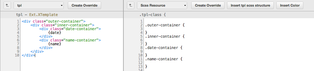
Theming templates
When working with templates, you can create a Sass resource linked to the template. You can insert the template structure into the linked Sass resource by clicking the button in the editor. This way you can jumpstart your styling, since all the classes in your template will be copied into the linked Sass resource.
Exporting a theme for Ext JS and Touch projects
After creating a theme with Architect, you can export it for reuse in Ext JS and Touch projects. It’s a manual process, but it is quite straightforward.
The following steps require you to have Sencha Cmd 4+ installed and set up.
For Sencha Touch 2.3:
- After you’re done with theming, build your Architect project
- In your Architect project folder, locate the exported css file:
build/testing/project-name/sencha-touch-xxx.css - In the Touch project that you are importing the theme to, create a ‘
theme’ folder at the root - Copy the CSS file to the newly created ‘
theme’ folder - In the Touch project, edit the app.json file as follows:
- find the ‘
css’ property - modify ‘
theme’ to the name of the theme it was based on, e.g. ‘Default’ - modify ‘
path’ totheme/sencha-touch-xxx.css
- find the ‘
- Execute
sencha buildapp to rebuild your Touch project with the new theme
For Ext JS 4.2
- After you’re done with theming, save the project and locate the theme package in your project folder:
project/packages/ext-theme-xxx - Copy the theme to your ext folder in your non-Architect project or workspace:
ext/packages - In your non-Architect project folder, edit app.json file to include the line ‘
theme’ : ‘ext-theme-xxx’. If the ‘theme’ setting already exists, modify it to point to the new theme - Execute
sencha build appto rebuild your Ext JS project with the new theme
Note: if you rename the theme while doing the steps above, make sure you also adjust all the references to the theme name in all the config files in the package.
Below, you can see the output from the Sencha Cmd Export Log. When saving or exporting the project, Sencha Cmd will report where the new theme has been saved.
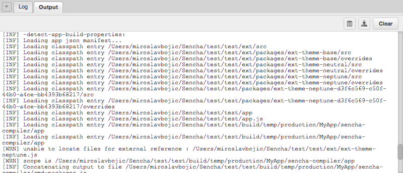
ext-theme-neptune-d3f6xxx has been exported into the packages folder within the project.
Bonus
If you are creating a full-blown theme rather than styling an app, we’ve created an Ext JS template containing all the commonly used components and settings in a single view — you can download it from market.sencha.com here. This template will let you see how the changes in the theme affect all the components.
Happy Theming!
Did you find the content helpful?
 0
0

 0
0

Latest Content

How to Write Unit Tests with Sencha Test
In modern software development, unit testing has become an essential practice to ensure the quality…
April 19, 2024

Highlights of Virtual JS Days 2024
Highlights of Virtual JS Days 2024 From February 20-22, 2024, we held the third Virtual…
March 12, 2024

From the GM’s Desk 2023: An Exciting Year for Sencha & Ext JS 7.7
We are past the midpoint of 2023 and we are very proud of what we…
August 11, 2023