


Building Sencha Touch Custom Components, Part 1
November 14, 2012
216 Views
 We’ve heard developers ask for more tutorials and guides for our frameworks, and today we’re walking through Sencha Touch component creation. I was recently asked to create an HTML5 component that would allow users to hear a preview of an audio track and show its progress inside a circular progress bar, similar to the iOS component. I accepted the challenge and in just four hours, created the Ext.tux.AudioCover component and wrote this 3-part tutorial that will explain to you, step by step, how to create your own custom components, also known as a “Touch User Extension” or “TUX”.
If you read Italian, you can check out my personal website for the original blog post.
Considerations before we start
The first thing we need is a clear idea of how our custom component should work and what features it needs to provide. Based on this idea, we could think about which standard Sencha Touch component we need to extend.
The Sencha Touch framework provides a large set of default components like Containers, Panels, Lists, Carousels, etc. all with different built-in features and behaviors. Here, I’ve chosen some components based on the basic features our Ext.tux.AudioCover component should have:
- Play audio files (preferably MP3)
- Provide some basic audio features such as Play, Pause and Stop
- Provide some basic information about the audio track it’s playing, such as duration and current play time
- Allow us to override its user interface
For developers already familiar with Sencha Touch, it’s clear that the component we are looking for is Ext.Audio. In fact, this component already provides us with all the functions we need to control an audio file and all of its information. In addition, it easily allows us to manipulate the HTML template used for rendering in our applications. This allows us to define the UI to show an image that will be used as a cover of the audio file, as well as the circular progress bar which will provide a visual indication of the current audio track time.
Let’s start by studying the native iOS component from a UI point of view, highlighting graphical characteristics and functionalities.
UI and functionalities review
By reviewing the native iOS components, we will have a good understanding of what HTML nodes we need in order to build the user interface, the CSS rules that should be applied to these elements and the events the components should handle in order to ensure the same functionalities. So, roll up your sleeves and let’s take a look at the following screenshots taken directly from iOS 6:
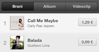
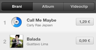
In the first picture on the left, you’ll notice the player in “Idle” status — this corresponds to when the playlist first renders, or when there are no visible tracks playing. When the player is in this state, each track component in the list shows album cover art. When a user “taps” a track, the track component plays its associated audio file and flips the cover element to show a circular progress bar as well as a stop button that allows users to stop the audio file and flip back to the audio cover image shown in idle status.
You will need to keep in mind that the component plays only one track at a time. If a user starts to play a track while a different one is already playing, this will bring the component back to “Idle” status.
The Challenge
This challenge consists of two goals:
- Create an HTML element that will allow us to overlap two divs, where the first one is responsible for displaying the audio cover, and the second one is responsible for displaying the circular progress bar.
- Create a non-standard circular progress bar.
Let’s walk through this challenge step by step, beginning with the Template Definition.
The Template Definition
The Template allows you to define a component skeleton in a really easy way. In fact, we only need to define a simple array. Each element in the array should contain the following information: what kind of HTML node should be created, the class to apply to it, a sub-array of children (if any) and a unique name that will be used inside the component to directly refer to every DOM node created.
The template definition process is really simple. Let’s take a look at the code shown in the next paragraph.
The Flip Card
Let’s start by defining the Flip Card template, which is the element that shows two different faces of our component, i.e. one side will display the audio track cover using a simple image, and the other side will display the circular progress bar.
The secondary face is a bit more complex, and we will explore that later; in the meantime, let’s just put a “Back” placeholder for the progress bar. Don’t worry, we are going to replace that really soon.
* @class Ext.tux.AudioCover
* @extend Ext.Audio
* @author Andrea Cammarata
*/
Ext.define(‘Ext.tux.AudioCover’,{
extend: ‘Ext.Audio’,
xtype: ‘audiocover’,
template: [
{
// The media element is required
reference: ‘media’,
preload: ‘auto’,
tag: ‘audio’
},
{
cls: ‘x-flip-card’,
reference: ‘cardEl’,
children: [
{
cls: ‘x-face x-front’,
reference: ‘coverEl’
},
{
cls: ‘x-face x-back’,
text: ‘Back’
}
] }
] });
Notice the node with the tag field set to “audio”. Since we are actually extending the “Ext.Audio” component, this node must not be removed. We are not going to completely rewrite the Ext.Audio component, but instead, take advantage of the existing functions and use them as the base of our TUX. If we were to remove the “audio” node, the component would not be able to render since the existing functions defined in the Ext.Audio component would not be able to find the “audio” node referenced through “this.media”.
We have defined the “cardEl” element which needs to have two children. The first child corresponds to the front face, and will show the audio track cover. The second one is related to the rear face, and will show the circular progress bar.
You may have noticed we have defined a reference only for the front face. That’s because the component should handle only the front face DOM node manipulation, updating the track cover when the user wants to change the image, and it will never need to work directly on the back face.
Now that we have defined the Flip Card template, let’s take a break to consider how these elements should be placed from a CSS point of view:
Let’s say that the “cardEl” element has the main role of container for its two faces. Both of these faces should rotate using the “Flip” transition. By applying the needed CSS transformations to the parent element of our two faces (i.e., the “cardEl”) both will rotate using the “Flip” transition.
We need to keep in mind that the front and the back face should not be positioned side by side but should be overlapped, one on top of the other, using an absolute positioning. In addition, the back face (i.e., the underneath layer) should be rotated 180° on the Y axis. In this way, when the entire “cardEl” is rotated, the back face will already be oriented correctly. You can also think of this as a piece of paper folded right in the center. In this way, you will be able to see what is written/painted on the back half of paper that needs to be rotated 180°.
The CSS rule we need for this is:
Lastly, we don’t want to forget that our faces need to hide their rear faces in order to avoid weird rendering issues; this can be achieved by:
The container “cardEl” should preserve all its children 3d CSS transformations by following this simple rule:
The Progress Bar
Before we start, I would suggest reading this article. It explains everything you need to know about a very interesting CSS rule: the Clip rule. In short, this rule allows masking of a portion of an image, div, etc. You can consider this as an evolution of the visibility: hidden rule, but instead of hiding the entire element, it shows just a segment.
Once you have a good grasp of this rule, take a look at the template below which will be used to perfectly render the circular progress bar and simulate its motion:
{
// The media element is required
reference: ‘media’,
preload: ‘auto’,
tag: ‘audio’
},
{
cls: ‘x-flip-card’,
reference: ‘cardEl’,
children: [
{
cls: ‘x-face x-front’,
reference: ‘coverEl’
},
{
cls: ‘x-face x-back’,
children: [
{
cls: ‘x-progress’,
reference: ‘progressEl’,
children: [
{
cls: ‘x-slice x-half’,
children: [
{
reference: ‘slice1’
}
] },
{
cls: ‘x-slice x-end’,
children: [
{
reference: ‘slice2’
}
] }
] }
] }
] }
]
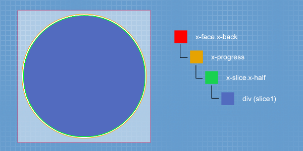
In this case, we have defined a “progressEl” container node that rounds out its borders using the “border-radius” rule and places the container in the center of the face. This will give the progress bar the circular look we want to achieve.
However, this is not enough. Taking another look at the above template you will notice that two different divs have been defined with the base CSS class “x-slice”, and that both of them have an additional child with nothing more than a reference name. This means that the component is going to manipulate these two HTML elements.
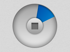
So, how can we simulate the progress bar motion using the defined HTML elements? Let’s take a look at the following images which illustrate the positioning of all the elements. These images only reference the first “x-slice” element (having the additional “x-half” class applied) and its child.
Looking at this picture, you can immediately notice that all the elements have the same circular look, size and position, except for the “x-face.x-back” container node. However, the only circular div which has a background color is the “x-slice.x-half” child, referenced as “slice1”. All the other elements have a transparent fill color.
Now that we have understood how these elements are placed inside our component rear face, let’s proceed:
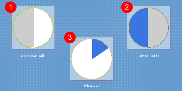
In these squares, you can see how the CSS “clip” rule has been applied to the element with the “x-slice.x-half” class and its “slice1” child. Keep in mind that the segment highlighted in gray will not be visible. Only the white section will be shown. As such, the child element will be completely invisible if it is positioned beneath the gray segment. When the progress bar is rendered when the audio track play time is equal to zero, the blue segment representing the track’s progress will be completely hidden because its start position will be right under the parent HTML “x-slice.x-half” node.
Now, all we need to finally give life to our progress bar is to synchronize the current time of the “media” element that we have defined in our component template, with the “slice1” element Z axis rotation. Now every time the media current time is updated, the visible part of the “slice1” element will enter the visible right segment of its parent node, and with each second, it will show a bigger part of its blue background color, as illustrated in the box number 3.
At this point we only have one problem. We can only rotate the “slice1” element by 180°, because if we rotate it any more, it will enter the invisible area again, messing up our component UI. But, that’s not a problem: if the audio track current time reaches its half duration point, the “slice1” element will have rotated 180°. We will start to rotate the “slice2” element so this element and its parent “x-slice.x-end” node will be placed having an initial position that is the right opposite of the first half nodes, and this will allow us to show the progress for the remaining part of our song.
It’s a tricky concept, but we will go over it in part two of this series. Please check out our next blog post where we will talk about the JS functions that will move our component gears.
Did you find the content helpful?
 0
0

 0
0

Latest Content

Introducing Rapid Ext JS: The Ultimate Low-Code Editor for Ext JS Development
We’re excited to announce the official release of Rapid Ext JS 1.0, a revolutionary low-code…
August 21, 2024

Sencha Architect 4.3.6 Has Arrived!
The Sencha team is pleased to announce the availability of Sencha Architect version 4.3.6. Building…
August 20, 2024

Introducing ReExt: A Game-Changer for React Developers
Sencha, a leader in JavaScript developer tools for building cross-platform and enterprise web applications, is…
August 20, 2024