

 Rapid Ext JS (beta)
 ReExt
ReExt


How to Create a Dark Ext JS Theme
– Part 2
July 21, 2015
109 Views
I’ve been showing you how to develop a fancy dark theme, which kind of looks like Spotify. In Part 1 of the article, you learned about Fashion, Sencha Inspector, Themes, and variables. In Part 2, I’ll focus on more advanced concepts including: making unique components with Ext JS UIs, CSS overrides, and how to incorporate custom fonts or icons.
You can use this tutorial to help you build your theme for the Sencha Application Theming Contest.
The first prize winner gets $2,500!
Custom CSS Rules and Mixins
There are a few more things I did in my Spotifext theme to make it look awesome. I wrote some CSS rules to animate the button hovers, used custom fonts, and created my own button and tab panel variants to give it a unique look.
With the variables I described earlier, you can change the overall look and feel of the application and all its components. But sometimes, you just want to make certain components unique. See the image below of my working Spotifinder app. You can see that the tab panel doesn’t look like the default Ext JS tabs. The buttons can be square or round, in the colors green or gray. I’m using Ext JS UIs, which are Sass mixins under the hood. A mixin is a block of CSS rules that can be re-used throughout an app.
Here’s an example Sass mixin:
@mixin my-border-radius($radius) {
  -webkit-border-radius: $radius;
     -moz-border-radius: $radius;
      -ms-border-radius: $radius;
          border-radius: $radius;
}
The above Sass mixin can be used to create rounded corners. I need to write experimental browser prefixes, so I can support this CSS3 feature across all browsers. Instead of writing every CSS rule myself, I can just include the my-border-radius mixin and pass in an argument, so all the CSS rules will be available after compilation:
.box { @include border-radius(10px); }
In the compiled CSS, it will look like this (but minified):
.box {
-webkit-border-radius: 10px;
     -moz-border-radius: 10px;
      -ms-border-radius: 10px;
          border-radius: 10px;
}
Sass mixins are a great concept that can be used in Ext JS as well. We call them UIs, and they’re basically skins. Ext JS includes out-of-the-box UIs. For example, in the modern toolkit, we have UIs for back buttons, round buttons, and more, and it provides UIs you can reuse with your own parameters.
You can find these mixins in the Sencha API Docs. For example, look at Ext.button.Button, you’ll see Sass Mixins in all different states for buttons. To implement these mixins, you’ll use @include, then the mixin name in Ext JS, and then pass in the arguments.
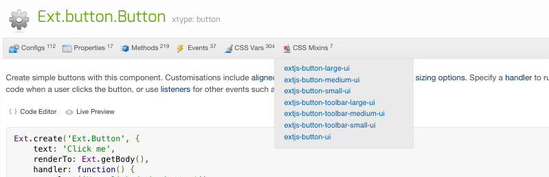
To create the nice rounded buttons, take a look here.
I used the below mixin code to create a new “scale: small” button. For arguments, I passed in the UI name: “round”, which I used in my view as ui: ‘round’), a font-weight, padding and a background color:
@include extjs-button-small-ui(
	$ui: 'round',
	$font-weight: bold,
	$padding: 5px,
	$background-color: $highlight-color
);
You might have noticed that the buttons are animated, and the tab panel that looks like Spotify is a lot different from the provided Ext JS mixins. Take a look at my sass/src folder. In this directory, I’ve written all Ext JS mixins and custom Sass rules.
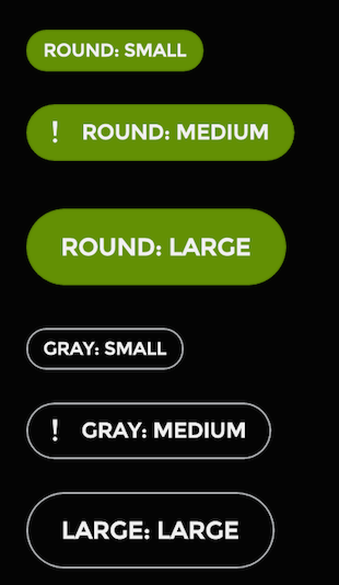
Unique Buttons
As you can see in my application, my buttons are more custom than the configuration provided by the API. My app contains code to make smooth animations. On every rollover, the button slowly lights ups. I did this by using custom Sass / CSS code.
Take a look:
.x-btn-round-large,
.x-btn-round-medium,
.x-btn-round-small {
	&:hover {
	  background-color: $highlight-color2;
	  -webkit-transition: background-color 2s ease-out;
	  -moz-transition: background-color 2s ease-out;
	  -o-transition: background-color 2s ease-out;
	  transition: background-color 2s ease-out;
	}
}
The CSS class names come from the mixin. I gave my small button the ui name: “round”. After I wire up this UI to my view code, I see in my browser DOM that the UI gave the component this class name: .x-btn-‹ui-name›-small.
All Sencha components get CSS class names by default with the .x- prefix. After that, it names the component (btn), then the UI name. For a button, it will also include the scale – or, if it’s in a toolbar. See mixin extjs-button-toolbar-small-ui.
The custom code I provided listens to the button hover. When I roll my mouse over the button, it will transition the background-color from the default background color (in my case black) to a new color (the green that I set in the background-color rule).
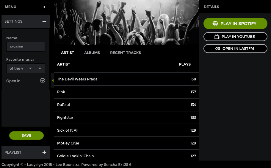
Unique Tabs
Sometimes you don’t want to use custom CSS code to add more functionality but instead to override the default look and feel. For example, when the UI mixin doesn’t provide the configuration you are looking for.
I did this to create unique-looking tabs. See the screenshot:

The code I used can be found here. Take a look at the .x-tab-bar-alternative CSS class.
You may be wondering when to use UI mixins versus mixins. UI mixins are great because they style the full application and contain code that supports every browser supported by Ext JS. The disadvantage is that your stylesheet code will grow. This is why I typically use UI mixins for styling, and rules that are re-used throughout my application.
CSS rules and overrides are great because they can be a quick solution. The disadvantage is that it’s complicated because you’ll need to test across browsers, and you really need to understand the generated DOM. I use CSS overrides and rules in case the UI mixin doesn’t provide the configuration, or when I need the CSS rule in only a few places.
Incorporating Fonts
The last thing I did in my custom theme was incorporate custom fonts and icons (which are icon fonts). Please take a look at this file.
I included two custom fonts. One google font (from the Google font provider), and one icon font called Spotifinder that I created on this website. I selected my own icon set, and I generated a font out of it.
Both fonts are @font-face fonts, so you have to include the different font extensions for various browsers in your stylesheet. For the icon font, I had to put them in manually. See the four font extensions. Usually when you create a custom icon font on an icon website like icomoon, you’ll be able to download the stylesheet that goes with it. In my case, I could just copy & paste it, but in some cases you’ll have to write it yourself.
The google font was really easy because Sencha provides a global UI mixin. This mixin puts the code for all the extensions in your compiled CSS code by importing the code from Google. See the docs. Please note that using custom fonts from a font provider (like Google Font) requires an additional request to the font. An alternative way to do it is to download an @font-face font yourself (from a website such as http://www.fontsquirrel.com/) and provide the full import code yourself. Just like I did for the icon font.
Once your font is correctly imported, you can start using it. I’m using the Google font by pointing the $font-family variable to it here.
Conclusion
That’s it! Now, I’ve explained everything you need to know to create an awesome theme, such as the Spotifext theme. Check out the screenshot below to see how it might look in a real-life application.
Don’t forget to sign up for the Sencha Application Theming Contest. The first prize winner gets $2,500!
Resources:
Ext JS Theming Guide
My SenchaCon Presentation
Tutorial Demo Files
Did you find the content helpful?
 0
0

 0
0

Latest Content

How to Write Unit Tests with Sencha Test
In modern software development, unit testing has become an essential practice to ensure the quality…
April 19, 2024

Highlights of Virtual JS Days 2024
Highlights of Virtual JS Days 2024 From February 20-22, 2024, we held the third Virtual…
March 12, 2024

From the GM’s Desk 2023: An Exciting Year for Sencha & Ext JS 7.7
We are past the midpoint of 2023 and we are very proud of what we…
August 11, 2023