What’s New in Sencha Themer 1.2

Last week, we announced that Sencha Themer 1.2 is generally available. Themer 1.2 now supports all of the exciting enhancements and new components in Ext JS 6.5. For developers using ExtReact components, you can now use Themer to uniquely theme components and give your React application a distinct look.
Download Now
Ext JS Pro and Premium customers: Download Sencha Themer from the Support portal.
Download Themer as part of a free 30-day Ext JS trial*
Download Themer as part of a free 30-day ExtReact trial
*Note: Themer 1.2 requires Cmd 6.5.
What’s New
Here are some of the new features and enhancements in Themer 1.2.
Support for Ext JS 6.5
Ext JS 6.5 delivers some amazing new capabilities for the Modern toolkit, so you can deliver rich experiences for mobile and now for desktop too. With more than 300+ new Sass variables in Ext JS 6.5, you can create amazing-looking applications with Ext JS 6.5 and Themer 1.2.
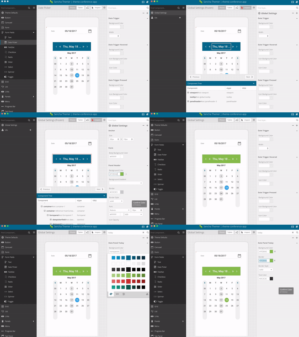
Easily Theme New Components Including Date Panel
Ext JS 6.5 provides a new datepanel component in Modern toolkit. On desktop devices, the datefield component uses the new datepanel. Themer makes it easy to change datepanel Sass variables for borders, panel headers, panel body, panel cell, panel focused cell, and caption.
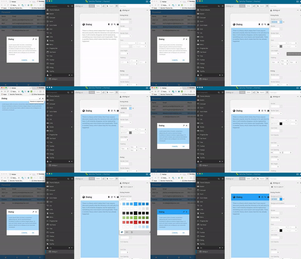
Create UIs with Distinct Looks for New Components Including Dialog
The new dialog component in Ext JS 6.5 is resizable, draggable and closable and provides a convenient way to display a “popup” component. With Themer, you can create UI mixins for generating multiple visual renditions of the dialog component by changing the styles of the dialog header, body, and tool, as well as different states of tools – disabled, hovered, pressed, and focused.
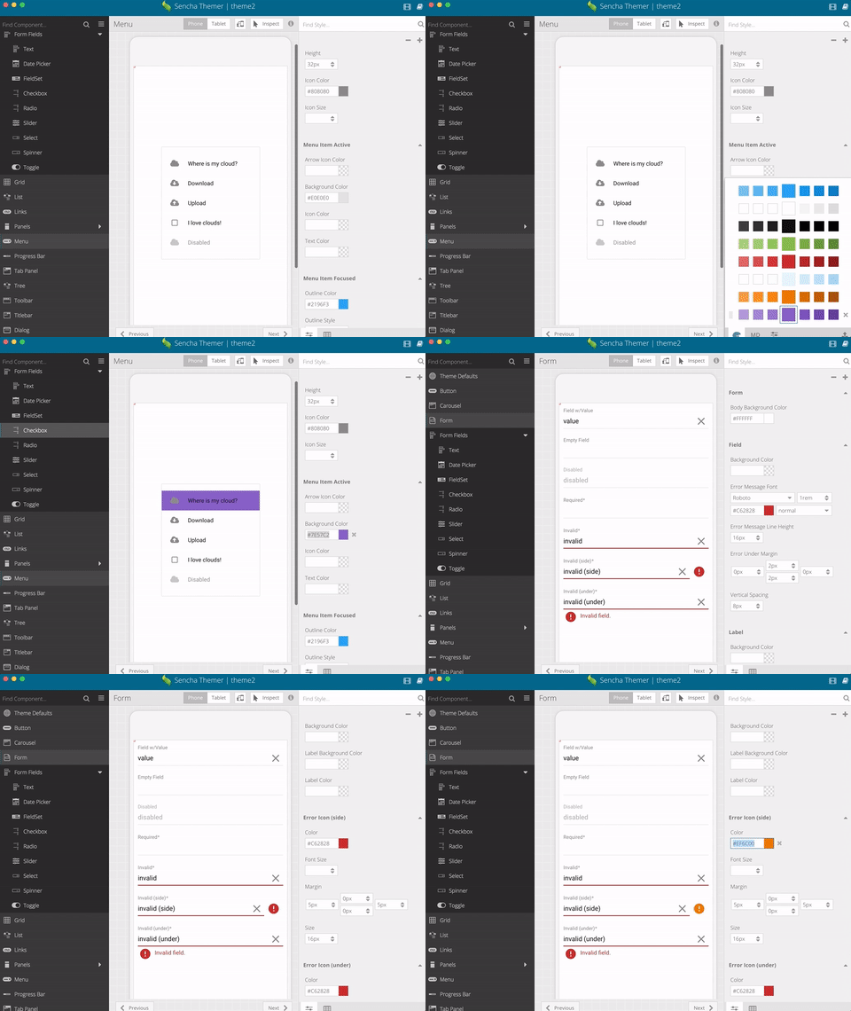
Theme Form Validations and Menus with New Theme Variables
Building sophisticated, data-entry applications requires creating forms with input masking and advanced validation features. In Ext JS 6.5, forms and field components have been enhanced with field validation and input masking. With Themer, you can customize error validations with error message fonts, line heights, under margins, as well as error icon colors.
Menus are an important component in desktop and mobile applications. They appear in places like context menus or multi-function buttons. Menu items can have icons, be checked, participate in “radio” groups and, of course, they can have sub-menus of their own. With Themer, you can easily create a “UI” mixin or change the styles of the menu border, header, icon colors, menu body, menu item, menu separator, as well different states of menu items – active, focused, disabled, and more.
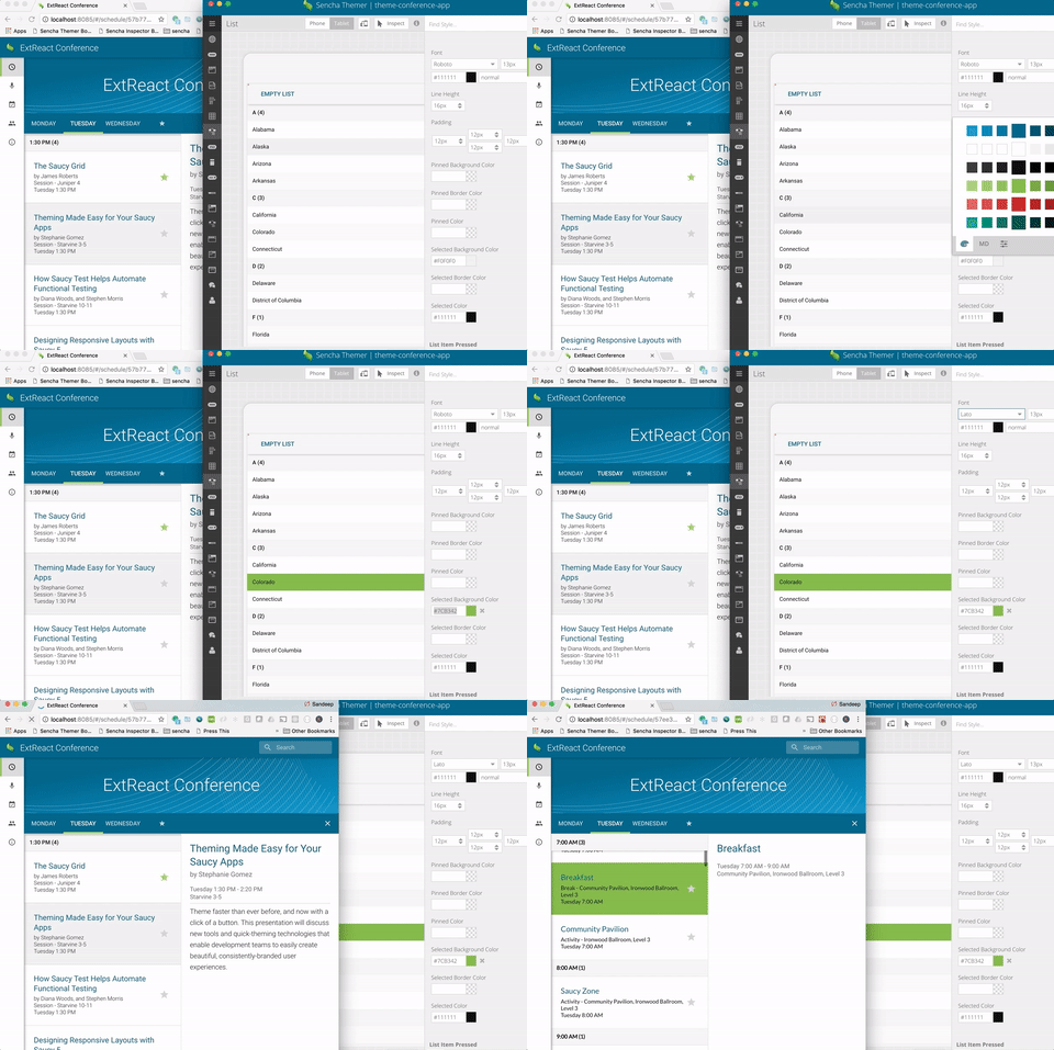
Support for ExtReact
Last week, we announced ExtReact, our newest product. ExtReact is the most complete set of professionally tested and commercially supported React components. ExtReact also features an extensive Sass-based theming API and support for Themer that gives developers complete control over the look-and-feel of their applications. With Themer 1.2, you can theme all ExtReact components and create UI mixins for generating multiple visual renditions of ExtReact components. Both designers and developers can create beautiful themes and apply them to ExtReact apps without writing code.
Try It and Share Your Feedback
We’re excited about this release, and we hope you enjoy building great looking apps with Themer 1.2 and Ext JS 6.5 or ExtReact. We look forward to reading your comments and feedback in the Sencha Themer forum.
We’re excited to announce the official release of Rapid Ext JS 1.0, a revolutionary low-code…
The Sencha team is pleased to announce the availability of Sencha Architect version 4.3.6. Building…

Sencha, a leader in JavaScript developer tools for building cross-platform and enterprise web applications, is…


