


How to Quickly Customize Ext JS Data Grid (Part 1/6)
February 27, 2020
186 Views
The Ext JS Data Grid is fast, powerful and flexible. With Ext JS, users can quickly customize the look and feel of the grid to suit their application. In a 6-part blog series, I will cover different ways to quickly customize an Ext JS Data Grid.
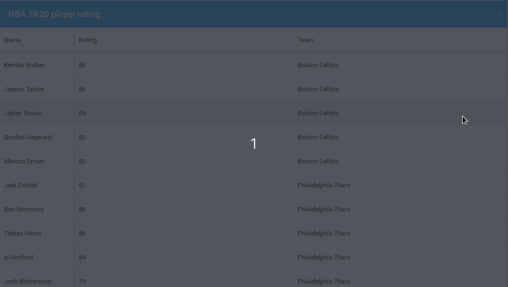
We will be setting up a simple grid that displays NBA 2020 player ratings.
This first blog demonstrates customization using Built-In Grid and Column Properties.
Setup Ext JS Grid
We first define a Ext.data.Model which is basically a collection of fields representing a type of data. Here we are defining the fields ‘player’, ‘team’ and ‘rating’.
extend: ‘Ext.data.Model’,
fields: [‘player’, ‘team’, {
name: ‘rating’,
type: ‘int’
}]
});
Now setup the Ext.data.Store containing the user instances. The example shows individual data, but in a real world application, the data could also be loaded from a server. You can do that easily using Ext.data.proxy.Proxy.
Here we are storing the data associated with ‘player’,’ team’ and ‘rating’.
model: ‘Player’,
data: [{
player: ‘Kemba Walker’,
team: ‘Boston Celtics’,
rating: 88
}, {
player: ‘Josh Richardson’,
team: ‘Philadelphia 76ers’,
rating: 79
}]
});
To display the data, we will use Ext.grid.Panel and customize it.
renderTo: document.body,
title: ‘NBA 2K20 player rating’,
//Define store
store: store,
columns: [{
dataIndex: ‘player’,
text: ‘Name’,
}, {
dataIndex: ‘rating’,
text: ‘Rating’,
}, {
dataIndex: ‘team’,
text: ‘Team’,
}]
});
Customize Grid and Column Properties
The grid created above with no customization looks dry and static.
Here are some popular properties you can use to make the grid more feature friendly.
Grid Properties:
- collapsible: expand/collapse toggle tool added to the header
- headerBorders [classic]: display or hide grid borders
- selModel [classic]: configuration for selection strategy
- hideHeaders : hide column headers
- title : display title in grid title bar
- width, height: specify grid width and height
- store: contains the data displayed
Column Properties:
- dataIndex : field name in model
- text: column header text
- locked: lock a specific column
- sortable: allow column sorting
- width: adjust column width
- flex: adjust column flex
- align: adjust column align
renderTo: document.body,
title: ‘NBA 2K20 player rating’,
//Turn on collapsible
collapsible: true,
//Display borders
headerBorders: true,
//Define store
store: store,
columns: [{
dataIndex: ‘player’,
text: ‘Name’,
//Lock column
locked: true,
width: 150,
//Deactivate sort
sortable: false
}, {
dataIndex: ‘rating’,
text: ‘Rating’,
flex: 1
}, {
dataIndex: ‘team’,
text: ‘Team’,
flex: 1,
//Deactivate sort
sortable: false
}]
});
Explore the code in the Fiddle tool
For more config properties, view the extensive Ext JS Grid and Panel documentation.
Stay tuned for our next blog covering “Grouping Methods” to customize grids.
Build Your Data Grid with Ext JS 7.1
The free 30-day trial of Ext JS 7.1 provides full access to the product features. Get started today and see how you can build a high-performing data grid for your application.
Did you find the content helpful?
 0
0

 0
0

Latest Content

Introducing Rapid Ext JS: The Ultimate Low-Code Editor for Ext JS Development
We’re excited to announce the official release of Rapid Ext JS 1.0, a revolutionary low-code…
August 21, 2024

Sencha Architect 4.3.6 Has Arrived!
The Sencha team is pleased to announce the availability of Sencha Architect version 4.3.6. Building…
August 20, 2024

Introducing ReExt: A Game-Changer for React Developers
Sencha, a leader in JavaScript developer tools for building cross-platform and enterprise web applications, is…
August 20, 2024