Announcing Ext JS 6.5 and Sencha Cmd 6.5 GA
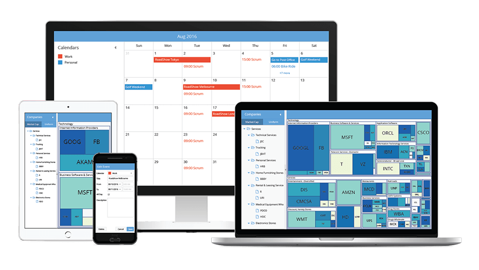
On behalf of the entire Sencha team, we’re excited to announce the release of Ext JS 6.5 and Sencha Cmd 6.5. Ext JS 6.5 delivers some amazing new capabilities for the Modern toolkit. Things like powerful new Grid functionality, advanced Form validation, Menus, Dialogs, and more. If you think of the Modern toolkit as “mobile first”, you’re right. But if you think it is “mobile only”, Ext JS 6.5 will change your mind in a big way. With the Ext JS 6.5 Modern toolkit, you can deliver rich experiences for mobile and now for desktop too!
Highlights of Ext JS 6.5 and Cmd 6.5
- Powerful New Components including Dialog, Date Panel and an extensive upgrade to Modern Grid with spreadsheet selection, cell editing, and grid tools.
- Rich data visualization support with new charts and components such as Box Plot, Navigator, and D3 Org Chart.
- Enhancements to key components such as Tree with plugins for editing and List with swipe actions, pull refresh, and an improved scrolling experience.
- Virtual Store to manage and seamlessly scroll through massive datasets and Dynamic Package Loading for a smooth loading experience in large applications.
- Sophisticated Data Analysis support with more Excel-like features and enhancements to Pivot Grid with tabular layout, and Exporter with the ability to export pivot definition.
- Data entry intensive application support with Forms enhancements including field validation, input masking, box labels and the new ComboBox component.
- Full stack, real-life example applications including Employee Directory and Progressive Web App.
- ECMAScript 2015 (or ES6) support with Cmd 6.5 to create Ext JS applications using the latest advances in JavaScript standards.
Try It Out
- Download Ext JS 6.5 and Cmd 6.5 by visiting the support portal
- Download the free 30-day trial of Ext JS 6.5 and tools
- View the Ext JS 6.5 examples on any device
- Read the What’s New in Ext JS guide
- Read the What’s New in Sencha Cmd 6.5 guide
- Register for our upcoming webinar: What’s New in Sencha Ext JS 6.5 and Cmd 6.5
What’s New in Ext JS 6.5 Modern Toolkit
Most of the enhancements are in the modern toolkit, so we’ll dive into those first and circle back to cover new features that apply to both toolkits.
Grid
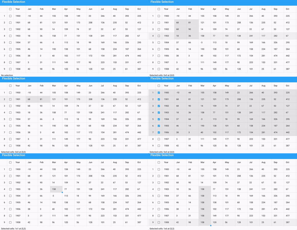
The Ext JS Grid is one of the most popular components and now it’s more powerful than ever before. For starters, the new selectable config in Grid gives you many new options to control selections of cells, rows, and columns. Together, these new options give users the ability to select data as they would in Microsoft Excel:
The Grid component now supports inline cell editing as well as form-based row editing. Choosing between these experiences is a simple task using platformConfig. For desktop users, inline cell editing using the “gridcellediting” plugin is a great choice. For mobile users, having the modal form to edit the fields of a row using the “grideditable” plugin is a better choice. We’ll see this code snippet soon.
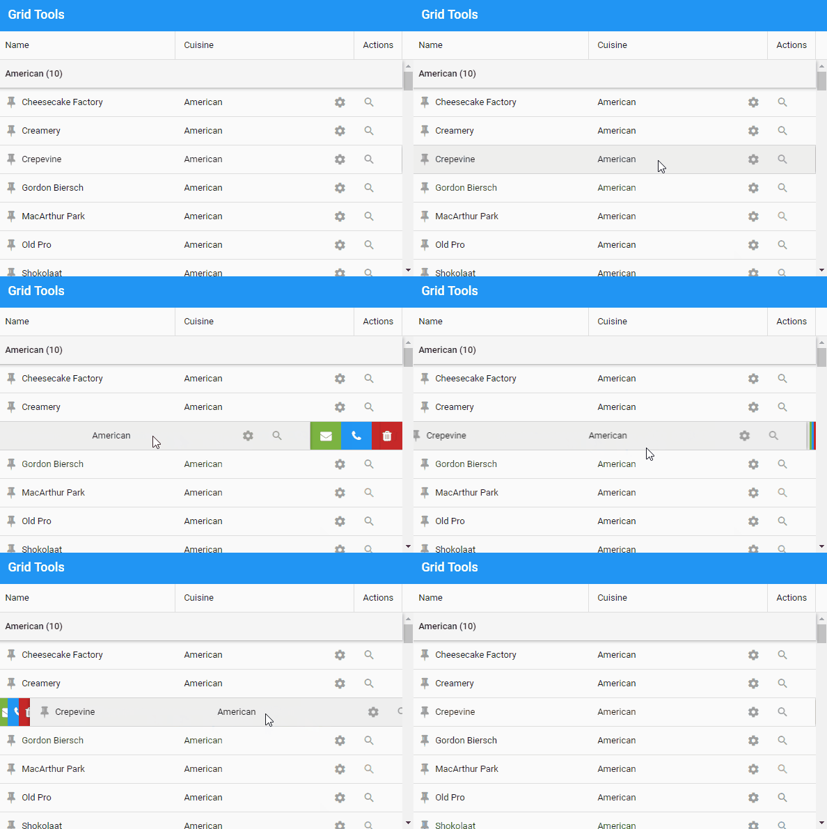
An icon in the right place can make functionality pop and help users get things done. Now you can augment cells, group headers, and even columns with tools (small, icon-only buttons). To pack extra capabilities into column headers, you can now easily populate a column menu (as in the Classic toolkit).
There is a lot more you’ll love about grids than we can fit in this article. For example, you can provide custom groupers for columns and pinned group headers and footers.
Tree
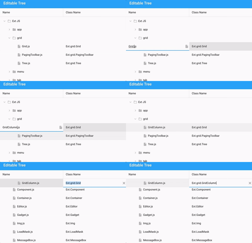
The Tree component is closely related to Grid and shares many of its features. This means that with Ext JS 6.5, the Tree component supports the same Grid plugins for editing content. For example, the “gridcellediting” plugin for desktop users:
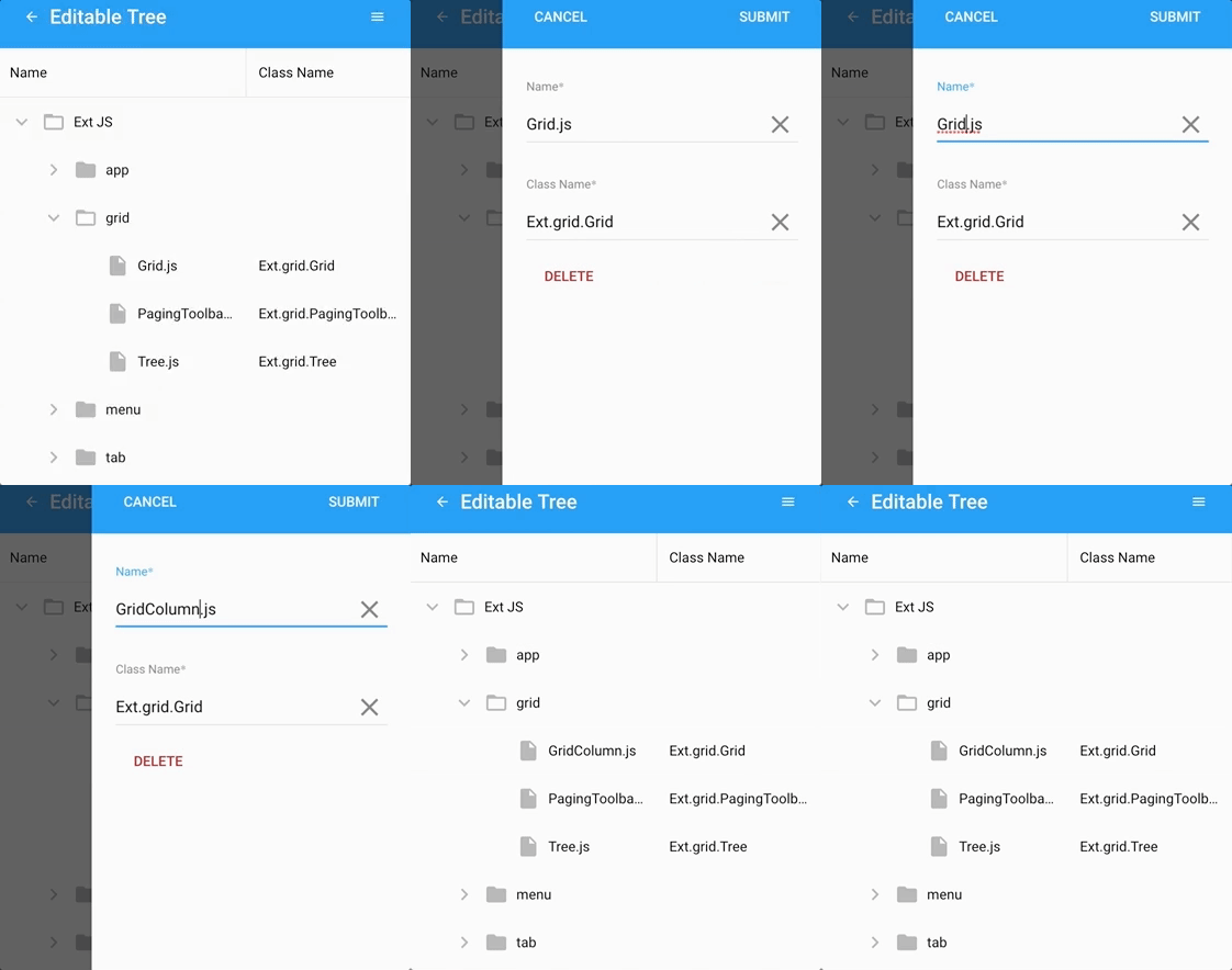
For mobile users, we’ll switch this over to the “grideditable” plugin. Something like this:
    platformConfig: {
        desktop: {
            plugins: {
                gridcellediting: true
            }
        },

        '!desktop': {
            plugins: {
                grideditable: true
            }
        }
    }
Virtual Store
The virtual store allows you to create grids and lists that render and scroll through extremely large datasets. Like the buffered store in the Classic toolkit, the virtual store loads only the pages needed by the grid. When combined with the List component’s infinite config, which is on by default in grids, only a small portion of these loaded records are rendered to the DOM.
All these optimizations ensure that the browser performs well for the user regardless of the amount of data you are presenting.
List
The humble List component has seen a lot of internal improvements in this release, and it also has a brand new plugin you’ll love. The new “listswiper” plugin allows you to add actions to list items, and it’s accessed by dragging the items to one side or the other. Below is an example that shows an accordion-styled swiper with undoable action.
You can also use listswiper in a “stepper” mode to allow users to step through actions one at a time when an item is swiped. And finally, because Grid is a subclass of List, the listswiper can be used in grids as well (acting like a “row swiper”).
You may not need both row swiping and a bunch of cell tools at the same time, but with the Ext JS Grid, all your options are open.
Forms
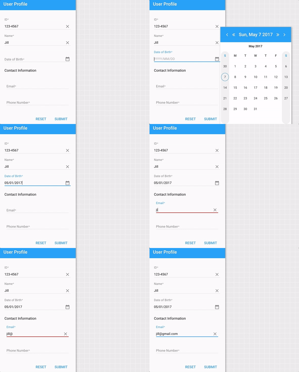
Building sophisticated, data-entry applications will be a lot less like rocket science with the new input masking and advanced validation features in Ext JS 6.5. We’ve also enhanced components like the Datefield, so they provide a great user experience on desktop as well as mobile.
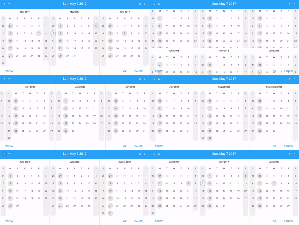
On desktop devices, the datefield uses the new datepanel component. Of course, you can use the Datepanel directly.
You can now easily connect multiple sub-fields together with a single label and error display using the new containerfield component. The containerfield acts as a general container, so it allows you to put pretty much anything in the field’s “body”, not just other fields.
Panels and Tab Panels
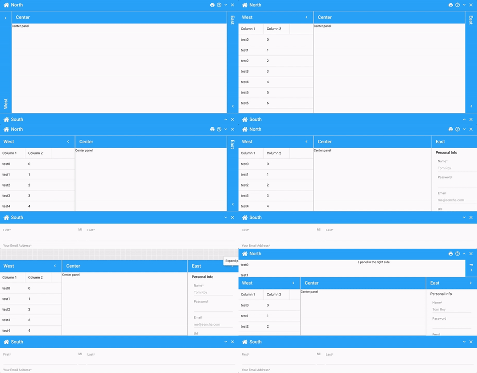
Many familiar features from the Classic toolkit are now available in the Modern panel, including header rotation, resizing, and collapsing – as shown below.
The configs that manage collapsing and resizing are all collected into the helper classes Ext.panel.Collapser and Ext.panel.Resizer, respectively. If you don’t need this functionality, simply don’t require them. If you do require them, requiring them will augment all panels with additional configs like collapsible, collapsed, and resizable.
For example:
    {
        xtype: 'panel',

        collapsible: {
            direction: 'right',
            animation: {
                duration: 300
            }
        },

        resizable: {
            dynamic: true,  // resizes as you drag
            edges: 'r',
            split: true
        }
    }
When a panel is collapsed, it can be temporarily revealed as a floated drawer. The various aspects of this presentation can be configured using the drawer config. The above animation shows how all of these things can be combined with the tried-and-true docked config to achieve the same result as the Classic toolkit’s border layout.
Tab Panels
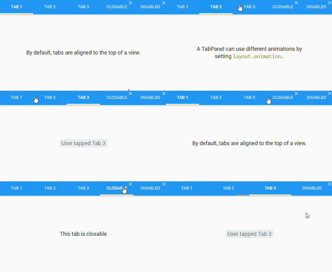
In desktop applications, tabs need some extra capabilities. With Ext JS 6.5, tabs not only have all the Material design goodies like ripple and indicator animation, they can be marked as closeable and disabled.
Menu
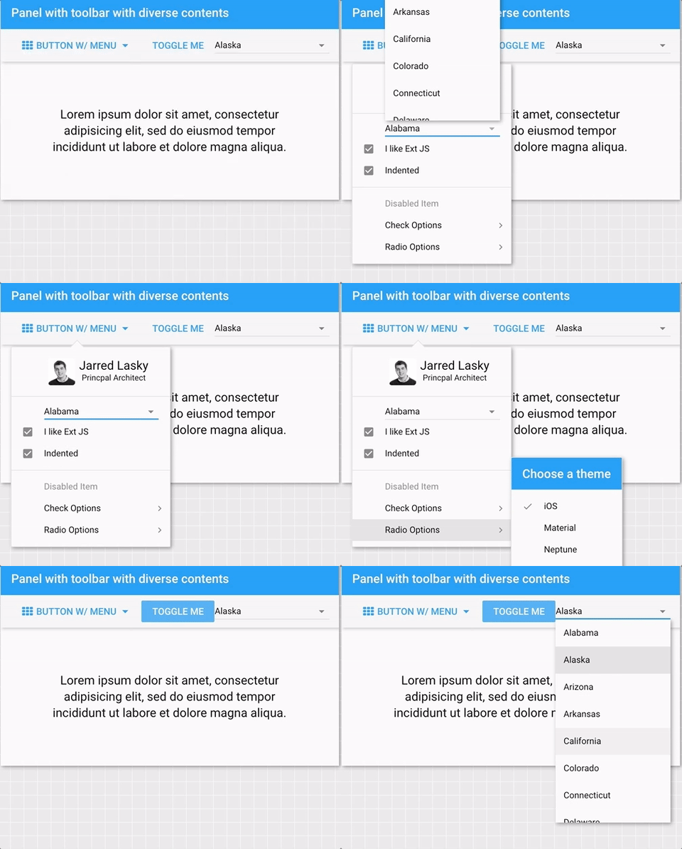
Menus are an important component in desktop applications. They appear in places like context menus or multi-function buttons. They can also be found in some mobile applications but with fewer embellishments.
Menus support all the features you’d expect from the Classic toolkit. Menu items can have icons, they can be checked, they can participate in “radio” groups and, of course, they can have sub-menus of their own.
Because Menus extend Panel, they support all the standard features of Panels such as anchors. This also means menus can contain any component (not just Menu items). This can be leveraged to great effect as shown below.
Accessibility, Theming, and More
Basic accessibility features like keyboard navigation and focus management have arrived in the Modern toolkit. For example, in forms and grids you can edit and navigate between cells, and many components now support keyboard activation. We’ve also significantly expanded the theming API to give you even more control over the appearance of components.
Those are the highlights for the new features in the modern toolkit. There are even more new things that we couldn’t cover here so check out the full write up in the What’s New In Ext JS 6.5 guide.
What’s New For Everyone
Now, let’s look at the improvements and features that apply to both Classic and Modern toolkits.
Charts
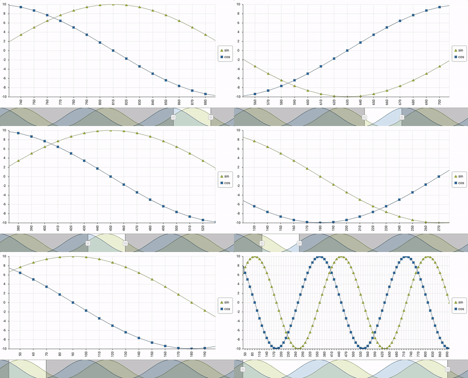
Charts now include a Box Plot and a Navigator component. You can use the Navigator component to set the visible range of the x-axis of a cartesian chart.
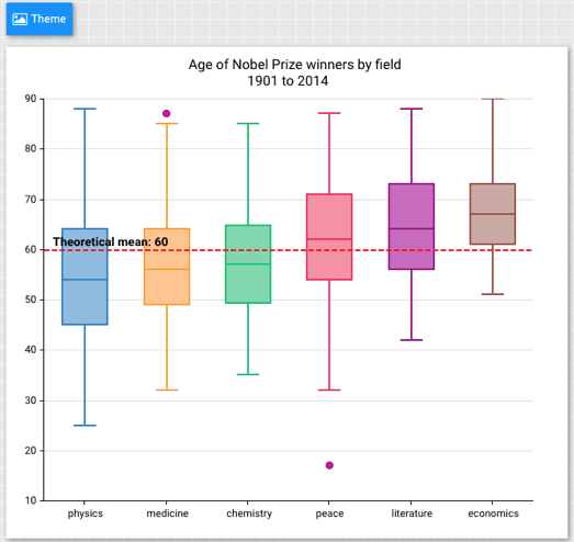
The new Box Plot chart is useful for displaying data from multiple data sets. The example below combines a Box Plot with a Scatter Series to display outliers.
The above chart also takes advantage of the new chart captions config, which provides an easy way to add text.
    {
        captions: {
            title: 'Age of Nobel Prize winners by field',
            subtitle: '1901 to 2014'
        }
    }
Each caption can be customized using a config object, but that is typically not needed because captions support themes and will look great even if you change the theme on the fly.
D3 Adapter
Ext JS D3 adapter package makes it simpler than ever to use D3-based data visualizations. With Ext JS 6.5, D3 Adapter has been upgraded to use D3 version 4 APIs. Also, we have added an Organization Chart visualization that works with hierarchical data – as shown in the example below.
Pivot Grid
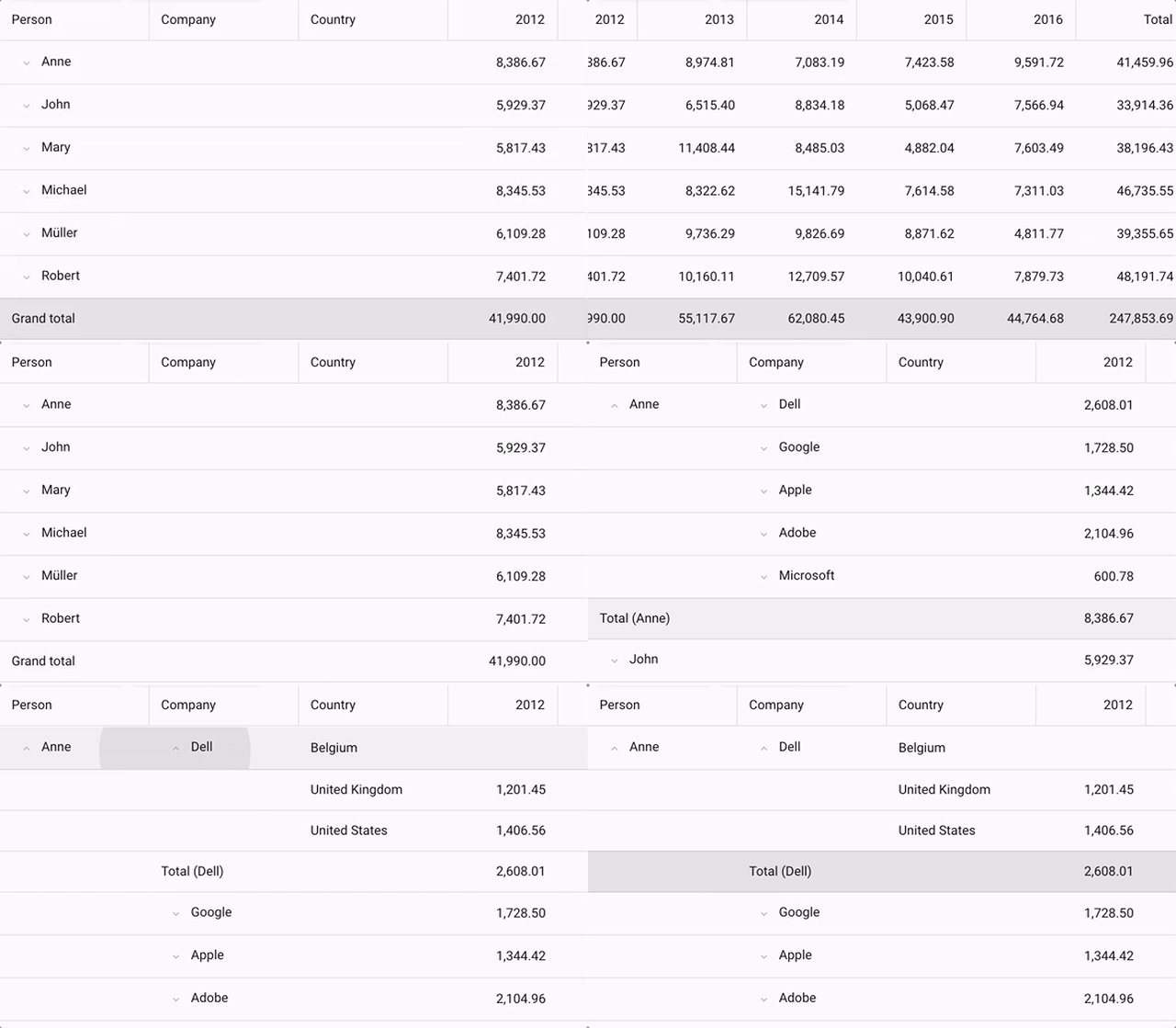
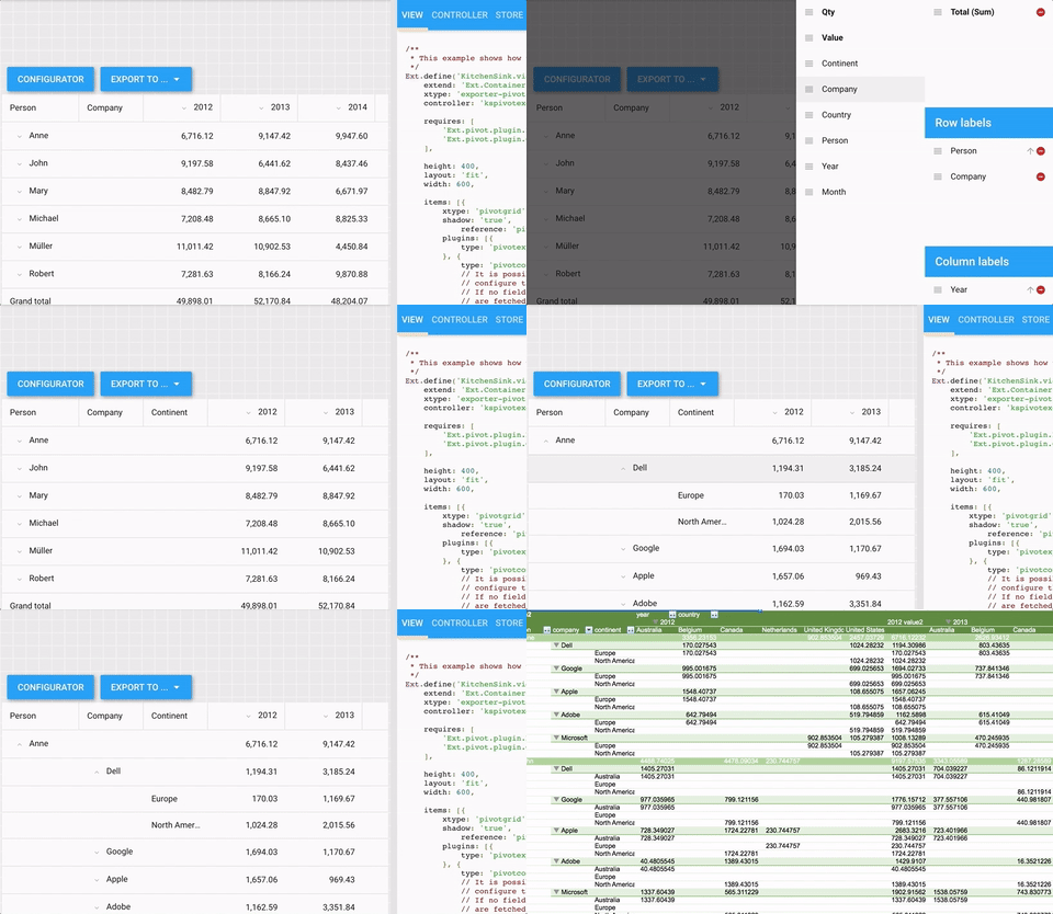
The Pivot Grid package helps you show a summarization of large datasets. With Ext JS 6.5, there is a tabular layout, similar to the Excel tabular form, for both Classic and Modern toolkits – as shown in the example below.
You can now include widgets inside a Pivot Grid, which allows you to create better visualizations – for example, to show a ticker or rating component. Pivot Grid now also has additional configs to create collapsible rows and columns – making it even more compact and easier to read.
Exporter
The Exporter package enables you to export data to various file formats. With Ext JS 6.5, Exporter now supports exporting pivot table definitions, which means your users can now export the raw data and the Pivot Table natively into Microsoft Excel. As shown in the example below with the exported xlsx file, you can see a pivot table on the first sheet and raw data on the second sheet.
Real-Life Example – Employee Directory
As part of this release, we’re also providing a full stack example application similar to those that are used in real projects. You can get the code from the GitHub repo and follow the instructions in the README file to get up and running. The GitHub repo contains both the Ext JS client application and the Node.js based back-end server. The Employee Directory application shows you how to build an adaptive UI for different form factors using the Modern toolkit. The application uses Ext JS 6.5 components including Grid, List, Map, Data View, Container, and Layouts – as shown below.
What’s New in Sencha Cmd 6.5
Sencha Cmd 6.5 helps you build large, modern, progressive web applications using the latest advancements in JavaScript standards. It includes the following key features:
ECMAScript 2015 (or ES6)
Sencha Cmd 6.5 supports transpilation, which is the conversion of modern JavaScript source code into JavaScript code that works on less-capable browsers (such as IE11). This means you can start writing code using arrow functions, the let keyword, object destructuring and pretty much all the cool new features in ES6, and Sencha Cmd will compile your code to run everywhere.
Under the covers, Sencha Cmd uses Google’s Closure Compiler to transpile and leverages all the polyfills provided by Closure, so you can also use those fancy new Array methods and not worry which browsers support them.
There are cases where you won’t need all that transpiling. Maybe you’re targeting Electron or you only support modern browsers that have all these features. You can disable the transpiler and still use the Sencha Cmd code compressor against your native ES6 code. Just a tweak to the app.json file and say goodbye to the transpiler and its polyfills:
    "output": {
        "js": {
            "version": "ES6"
        }
    }
Dynamic Package Loading
Sencha Cmd has supported the concept of packages for several years and large-scale applications often leverage packages to encapsulate classes, styling, and resources. Sencha Cmd then builds all of these pieces into your application. Now, you can use these packages in a whole new way – dynamically.
If you’re using packages today, you would see them in your app.json “requires” array:
    requires: [
        'dashboard',
        'settings',
        'users'
    ]
To switch to dynamic loading, simply move some or all of these into the “uses” array and add a new package to “requires”:
    requires: [
        'package-loader'
    ],
    uses: [
        'dashboard',
        'settings',
        'users'
    ]
After these changes, when you build your application with Sencha Cmd (see below), the application and each of the used packages will be placed in separate bundles. When your application loads, it will contain only its code and the code from its required packages, but not the used packages. Instead the JavaScript, CSS, and resources for these used packages will be in the application’s build folder just like images or other assets.
The Ext.Package.load() method then makes it trivial to load packages when you’re ready for them. The package loader handles the package’s JavaScript and CSS assets as well as recursively loading any packages that it may require.
If you’re using Ext JS routes, you might do something like this to load a package:
    routes: {
        ':type': {
            before: 'loadPackage',
            action: 'showView'
        }
    },

    loadPackage: function (type, action) {
        var view = this.getView(),
            pkg = this.getPackageForType(type);

        if (!pkg || Ext.Package.isLoaded(pkg)) {
            action.resume();
        }
        else {
            view.setMasked({
                message: 'Loading Package...'
            });

            Ext.Package.load(pkg).then(function () {
                view.setMasked(null);

                action.resume();
            });
        }
    },
Using dynamic package loading can be a real time-saver for your users. No longer will they have to wait for every byte of your application to load when in reality they only needed about 20% of it. It can also save time for developers because Sencha Cmd no longer has to load all their code to make a “dev” build or watch all their code at the same time.
There are a number of new command line switches to “app build” and “app watch” to give you control over which external packages (if any) to build or watch. For example, to fully build the application and all of its external packages, you would add --uses:
sencha app build --dev --uses
Or to build one specific package:
sencha app build --dev --package=Users
Making these external package builds explicit allows you to slash your build times by only building the pieces on which you are currently working.
See It In Action
To get you started, we’ve written a demo application that uses a handful of packages in some real-world scenarios. Check out the GitHub repo. The README file in this example describes other build switches you may find useful.
Progressive Web Apps
Progressive Web Apps (PWAs) provide a near-native app experience using modern web technologies. With a PWA, you can display a banner that invites Android users to install your app on their home screen. Through the magic of the service worker and its caching (currently supported in Chrome and Firefox), your app can even run offline.
Sencha Cmd streamlines the build process by providing a pre-built service worker (based on Google’s sw-toolbox). The service worker can be configured in app.json, and its cache manifest can be augmented by Sencha Cmd using @sw-cache comments in your source code. These comments tell Cmd that you need to cache particular resources and can also configure how each asset should be managed.
PWA Example
We’ve pulled together a progressive web application example to show you how it all works. Check out the GitHub repo and follow the README instructions to get started. The GitHub repo contains both the Ext JS App and the Node.js based back-end server.
Learn more by reading the What’s New in Sencha Cmd 6.5 guide.
Thank You
We’re very proud of this release. We’re looking forward to seeing the awesome web applications you create. We wish to extend our heartfelt thanks to our community and customers. Your constant involvement, feedback, and bug reports have made it possible for us to achieve this huge milestone. We hope you enjoy building great apps with Ext JS 6.5 and look forward to your feedback in the Ext JS forum and Sencha Cmd forum.

We’re excited to announce the official release of Rapid Ext JS 1.0, a revolutionary low-code…
The Sencha team is pleased to announce the availability of Sencha Architect version 4.3.6. Building…

Sencha, a leader in JavaScript developer tools for building cross-platform and enterprise web applications, is…


