Rapid Ext JS


Creating Custom Reporting Front-Ends with Ext JS
June 23, 2016
180 Views

Over the course of its evolution, a vast majority of our customers have used Ext JS to create customized front-ends for their reporting solutions, or more often customized reporting functionalities within their Ext JS applications. The core reasons that developers use Ext JS for their custom reporting applications are the in-memory data package, the data grid with sophisticated functionalities such as grouping, sorting, and filtering, and a robust charting package that comes fully integrated with the data package. With the release of Ext JS 6, we introduced Pivot Grid, which takes custom reporting built with Ext JS to a whole new level. Not only can developers build customized front-ends for reporting solutions, but it also enables them to create ad-hoc reporting i.e. slicing and dicing data in an easy-to-use drag-and-drop environment.
In this article, we’ll look at the 5 core components of Ext JS that make it a perfect solution for building customized reporting front-ends and why those components are a must for any custom reporting solution.
Data Management
Traditionally, reports were just used as a visual instrument to share raw or aggregated data presented as rows and columns, so you could use the plain old markup to create an HTML table in your browser to represent your data. But today’s end users are much more sophisticated and demanding. They not only want to see their data, but also interact with it. Sorting, filtering, grouping, etc. are some of the features that they expect to be available for any report. In order to achieve such interactions and more, you need a way to manage your data in the browser’s memory.
The Ext JS Data Package is one of the most significant components available in the framework that lets you manage all your application data in the browser’s memory. It consists of a multitude of classes, but the three most important ones are the ‘Model’, ‘Store’, and ‘Proxy’, which allow you to a) create a model representation of your data for the browser, b) use a collection store for your records, and c) use methods to load and save your data from any remote or local data source, respectively. With the Ext JS data package, performing operations such as sorting, filtering, and grouping, locally or remotely, is a very simple task.
Data Display
Reports generally present numerical data in a tabular format. They often carry text, links, or even images. Due to the need for an orderly style of presentation, data grids are the most popular choice for presenting information in reports.
The Ext JS Data Grid is the most popular component of the framework that helps you not only present all kinds of data in an orderly format, but also interact with the data in ways that you would only expect in a spreadsheet-like application. Features including sorting, filtering, grouping, pagination, column reordering, tree grid, formatting, and data selection (the list goes on) – all available by default. It is arguably the most powerful data grid available for the web today, and it works seamlessly with the Ext JS data package, so you can put as much data as you want in the grid.
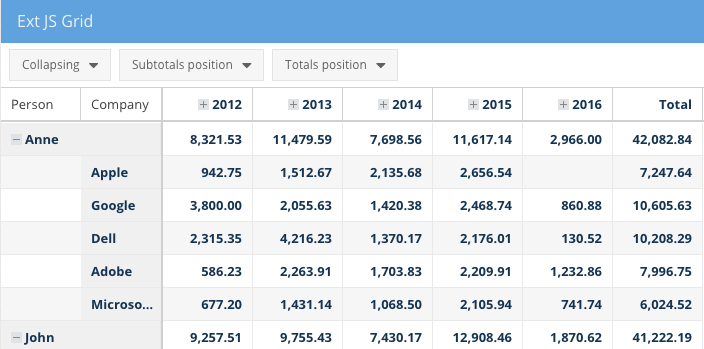
The Ext JS Grid not only allows you to interact with your data, but also manipulate it, if needed, and the associated data package helps you keep the data in sync with your back-end database (remote or local).
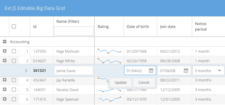
Another great aspect of the Ext JS Grid is that it lets you use micro-charts within the cells, so you can start to visualize your data with the tabular displays.
Data Visualization
Most reports today use some form of data visualization because it is often too difficult to understand tabular data after you reach a certain number of rows and columns. In the context of reports, the main goal of data visualization is to use charts and graphs to explain the story that the data is telling. Example: Are my sales trending upward or downward? It’s a hard question to answer if you just have a table of your sales data. Data visualization adds the element of intuitiveness that’s needed to understand what’s in a report.
Ext JS offers an amazing charting package, Sencha Charts. If you haven’t seen it, spend some time browsing through the many beautiful examples in our Sencha Charts Kitchen Sink. Like every other component that Ext JS offers, Sencha Charts is also pre-wired to the data package, so you don’t have to do much coding to add charts to your reports. The most significant benefit of using Sencha Charts is that, as you update the data in your models, both grids and charts are updated automatically because they feed off of the same models and stores (unless you explicitly tell them not to).
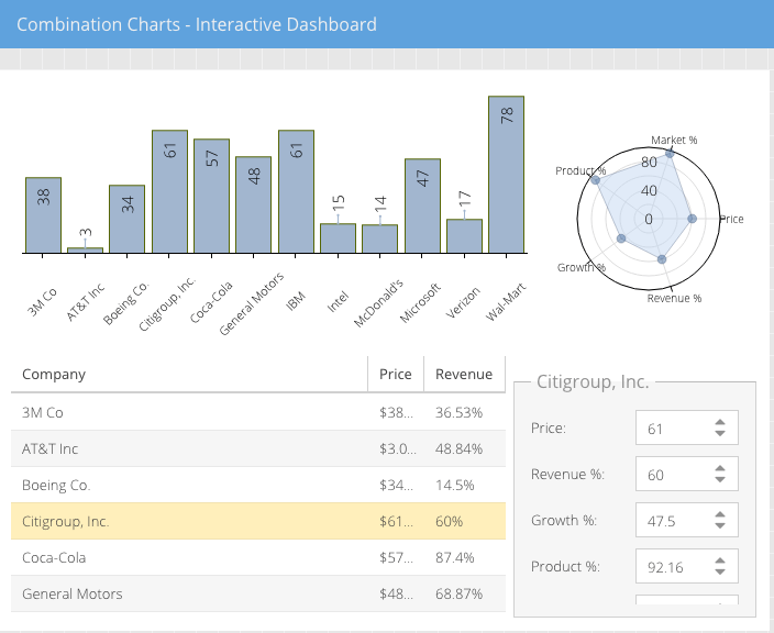
The Ext JS Data Package helps you keep the tabular and graphical elements of your reports in sync. This is very difficult to achieve if you plan on using other third-party charting libraries, because they require tight integration between the charts/graphs and the Ext JS data package.
Data Analysis
As mentioned before, today’s end users are much more sophisticated and demanding, and they expect to be able to slice and dice their data, which is probably the most difficult part of building a custom reporting front-end. You not only need components for displaying, managing, and interacting with your data, but also components that help with aggregating your data on the fly.
The Pivot Grid component, which is part of the Ext JS Premium package, enables rapid summarization of large sets of data. It provides a simple way to aggregate records across one or more dimensions by simply defining an ‘axis’ and an ‘aggregation’. Depending on your data size, you can perform these aggregations in your browser’s memory, or use a back-end aggregation script, to avoid freezing the browser when the data is too large.
While ‘axis’ allows you to determine the rows and columns in your resulting report, the ‘aggregation’ manages the calculations. Pivot Grid includes many aggregation methods out of the box including sum, average, min, max, count, and you can even define your own aggregation functions. Any results generated by Pivot Grid can be sorted, grouped, filtered, and displayed in various layouts such as ‘outline’ or ‘compact’ for proper display of the data. Pivot Grid also lets you automatically add subtotals and grand totals across rows and columns, if needed. For situations where you can’t anticipate how users will interact with the data, Pivot Grid provides a configurator plugin that lets an end user select or deselect dimensions and aggregations in an easy-to-use drag-and-drop environment.
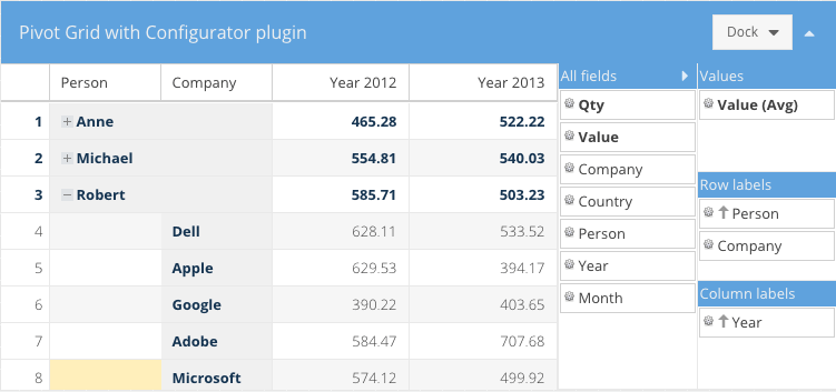
Furthermore, you can drill down to the raw data using Pivot Grid, should you need to. All of these out-of-the-box functionalities make it very easy to create a custom reporting front-end for your Ext JS applications.
Data Export
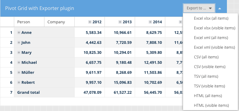
Finally, the last but very critical piece of creating any custom reporting front-end is a data export capability. Irrespective of what data you provide within your reporting, users always want to export that data into formats such as Excel, CSV, TSV, etc. to be able to use the data in other systems for various reasons. For instance, someone may want to export a report from a business application and import the data into an accounting software package, so they can combine and analyze it with information in that system.
The Ext JS Data Export plugin allows any data in an Ext JS Grid or Pivot Grid to be exported to Excel, CSV, TSV, XML, and HTML formats.
Conclusion
If you are in the process of building a custom reporting front-end for your business application, Ext JS has a great set of components for managing, displaying, visualizing, analyzing, and exporting the data that will be consumed by your reports. You can build canned reports or provide an ad-hoc reporting capability in your application.
Did you find the content helpful?
 0
0

 0
0

Latest Content

Ext JS 7.8 Has Arrived!
The Sencha team is pleased to announce the latest Ext JS version 7.8 release. Following…
May 13, 2024

React Apps Development Using ReExt with Ext JS Components
The world is moving fast towards online businesses. Businesses are established online via social media,…
May 1, 2024

How to Write Unit Tests with Sencha Test
In modern software development, unit testing has become an essential practice to ensure the quality…
April 19, 2024