


Inside the Ext JS 4.1 Layout System
October 22, 2012
118 Views
Introduction
With the release of Ext JS 4.1, we focused considerable attention on the layout system to ensure that it performed more consistently and efficiently. This meant overhauling how size information was shared between layouts to reduce the number of browser reflows.
The general concepts behind the new layout system were described in an earlier article and in a presentation at SenchaCon 2011. In this article, we’ll explore how the individual core layouts like “hbox” and “dock” collaborate to produce what you see on the screen. Along the way, we’ll also show how some of the less obvious combinations of layout options can be used together.
This article assumes that you already have an advanced understanding of how to use layouts in Ext JS and then pulls back the curtain to show you how the framework processes these high-level configurations. Having this insider’s view of the layout system can be very helpful. By knowing how these pieces work together, you can get the most from each layout and make it work as efficiently as possible.
Overview
There are a handful of players involved in any Ext JS layout. The most obvious are layout classes like “hbox” or “border”, but there are others that work behind the scenes: the layout context, context items, size models and size policies.
Division of Labor
There are two categories of layout classes: component and container. Instances of these two types of layouts are managed by the “layout context” (Ext.layout.Context) which serves as the central hub through which individual layouts connect. The layout context contains the logic for gathering and executing the individual layouts as they work together to determine the solution for all of the unknown values.
A container layout is responsible for managing the items in a container (the components in the “items” collection). These are the types of layouts that most users have encountered. The hbox layout and fit and border layouts are examples of container layouts. Unless otherwise specified, the default container layout is the “auto” layout.
The partners of the container layouts are the component layouts, though these are rarely addressed directly in a developer’s application code. The primary function of a component layout is to manage the size and position of the HTML elements that make up a component. The default component layout is the “autocomponent” layout. Some component layouts, such as the dock component layout used by panel, for example, also manage components. In the case of the dock component layout, it arranges the docked items around the outside of the container space.
The layout context manages the “layout run” which occurs when its “run” method is called. The first phase of a layout run is to gather all of the pertinent layout instances and create wrapper objects called “context items” (Ext.layout.ContextItem) to wrap the DOM elements involved. It’s through these objects that results are shared as well as (eventually) flushed to the DOM. These objects are discarded once the layout run is complete.
Strategy
With all of these objects working so closely together, it can be hard to know which of them is responsible for solving each of the unknown values. For example, usually each dimension, such as the “width” of a component, is shared by up to three layout objects: the component layout for that component; the “ownerLayout” (typically the container layout of the component’s owning container) and the container layout (if the component is itself a container).
Due to this proximity, the single most frequently asked question about layouts in their calculations is “should I solve for the dimension of this child item or is some other layout responsible for it?” This sounds like a very simple question. Indeed, over time each layout class evolved its own way of deciding when it should be involved for each dimension.
The problems with this ad hoc approach became clear once we integrated multiple layouts in a single layout run. Because the ad hoc approach wasn’t entirely consistent, sometimes multiple layouts would attempt to solve for the same dimension creating race conditions and performance drains. The worst outcome of this, however, was when no layout believed it was responsible and the calculation process failed.
Size Model
To resolve this situation, we introduced the concept of a “size model” (Ext.layout.SizeModel) to enumerate all of the possible sizing scenarios. For each size model, there is a designated layout responsible for managing the result. A size model is just an object containing a “width” and “height” property. These properties are, respectively, referred to as the “width model” and “height model”. These objects contain various properties that make testing the size model convenient.
This all boils down to only four fundamental size models: calculated, configured, shrinkWrap and natural, so each dimension of a component is determined in one of these four basic ways. The first two are likely obvious. A “calculated” dimension is one where the layout must calculate the size (e.g., using a “flex” in a box layout). The “configured” size model describes a dimension determined by a config property such as “width” or, more interestingly, “minWidth” or “maxWidth”. The final two size models are flavors of so-called “auto size”. The difference between these models is whether size is determined by the content (shrinkWrap) or by measurement of the outermost element (natural).
In code, size models commonly appear in checks for whether or not a dimension is “shrinkWrap” because, in many cases, this distinction alone determines the data flow direction. In a shrinkWrap height scenario, for example, the outer height is determined by the content whereas in all of the other scenarios, the outer height is known by some means and this may then affect the height of the content.
Things get more interesting when shrinkWrap is present in a component hierarchy because using shrinkWrap means that container dimensions will not be available for sizing content. Consider a panel with shrinkWrap height using a “fit” layout. The fit layout can’t consume the height of the panel to size the child item since that dimension is determined by the height of the child item. Similarly, box layout can’t apply flex on a shrinkWrap axis because the container size is required to determine the flex distribution.
Much of the logic to determine the size model of a component is found in getSizeModel on AbstractComponent. This method handles combining various configuration properties (like “width” or “height”), but a key part of the determination is based on what the ownerLayout of the component plans to do given the layout-specific configuration properties (like “flex”). This information is described in an object called the “size policy”.
Size Policy
The size policy is a description of how a layout will interact with the dimensions of a component it is managing. That is, it indicates whether the layout will read or set (or both) each dimension. The size policy is a simple object containing properties “readsWidth,” “setsWidth,” “readsHeight” and “setsHeight”. In addition to being used to determine the size model of a component, the size policy can be used to avoid measuring dimensions if no layout plans to use it.
The layout’s getItemSizePolicy method uses its own configuration and that of the child item as the primary means for deciding the size policy. The other key factor in determining the size policy is often the size model of the container. To get this, the sequence repeats itself one level higher, and we ascend the hierarchy until this is no longer needed or we reach the root. During a layout run, this can be cached on the container’s context item since these properties don’t change in the middle of the layout process.
Execution
With the plan determined, the layout context iterates over the unfinished layout instances and calls appropriate methods until there are no unfinished layouts remaining. From the point of view of a single layout instance, this basically consists of these method calls: beginLayout, beginLayoutCycle, calculate, completeLayout and finishedLayout.
These method calls are described in detail in the documentation but to summarize here are the basics:
beginLayoutis called only once at the start of each layout runbeginLayoutCycleis called when a layout must restart its calculation (typically this is once per layout run, but could be called again in a two-pass situation like stretchmax)calculateis called as many times as necessary to produce results (this stops when the layout is marked as “done”)completeLayoutis called when a layout is marked as done and its element data has been flushed to the DOM (the layout may need to restart itself, for example, like a box layout overflow handler)finishedLayoutis called at the end of the layout run.
The calculate method is designated as a “read phase”, that is, a time where it is appropriate to read DOM properties or measure elements. All of the other methods are designated as “write phase”. This separation allows the layouts in the run to synchronize their read and write activities and minimize expensive browser reflows.
Panel Example
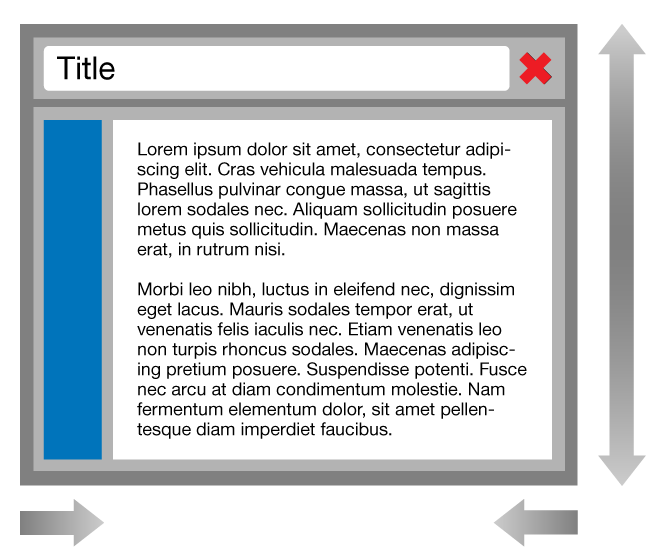
To illustrate how all of these inner workings of the layout system come together, consider the following simple example: a panel with a title and two child components managed by an hbox layout.
xtype: ‘panel’,
title: ‘Title’,
width: 200,
closeable: true,
renderTo: Ext.getBody(),
layout: {
type: ‘hbox’,
align: ‘stretchmax’
},
items: [{
xtype: ‘component’,
style: ‘background-color: blue’,
width: 30
},{
xtype: ‘component’,
flex: 1,
html: ‘
Lorem ipsum …
‘
}]
}
To help emphasize the distinct components, see Figure 1 which shows gaps between all of the components and some of their key elements. This should help make the players in the layout a bit more obvious.
To clarify a bit about panel headers: the panel class detects the “title” configuration and creates an Ext.panel.Header component that is docked at the “top”. This header also uses an hbox layout to manage a child component for the title (with flex of 1) and the close tool.
This detail is one of the major advances in layout management from Ext JS 3 and prior. In those versions, panel headers had very specific properties and could not be manipulated except via the DOM. In Ext JS 4.x, the panel header is just a container. You can add and remove components as desired and the “special” pieces produced by the panel class are just standard components.
Division of Labor
In this example, we have the following six components and their component layout instances involved (using the notation “layoutType<componentId>”).
- dock<panel-1> — the Panel itself
- body<header-2> — the panel header
- autocomponent<component-3> — the title text component
- autocomponent<component-4> — the header’s tool component
- autocomponent<component-5> — the first child of the panel
- autocomponent<component-6> — the second child of the panel
We also have these container layouts:
- hbox<panel-1>
- hbox<header-2>
Strategy
The size models for the components are:
panel-1: width=configured, height=shrinkWrap
header-2: width=calculated, height=shrinkWrap
component-3: width=calculated, height=shrinkWrap
component-4: width=configured, height=configured
component-5: width=configured, height=calculatedFromShrinkWrap
component-6: width=calculated, height=calculatedFromShrinkWrap
The “calculatedFromShrinkWrap” size model is how we describe the two-phase size model produced by a layout that both reads and sets the height (in this case, due to the stretchmax option). The idea is that the component behaves basically as if it were shrinkWrap for phase one (to determine the maximum height) then switches to calculated for phase two (to stretch to the maximum height).
Rather than show all of the size policies involved, it is sufficient to show just the two for the components in the panel. For component-3:
readsHeight: 1,
readsWidth: 1,
setsHeight: 1,
setsWidth: 0
}
And for component-4 (the one with flex=1):
readsHeight: 1,
readsWidth: 0,
setsHeight: 1,
setsWidth: 1
}
Common to both is the “readsHeight” and “setsHeight” flags. This is understood to mean “reads and then writes”. These two size policies are exactly opposite on the “readsWidth” and “setsWidth” flags.
Execution
As you can see in Figure 1, the sizes propagate in different directions. The width, being set on the outside, propagates inward or down the component hierarchy. The shrinkWrap height model means that height flows in the opposite direction. Height flows outward or up the component hierarchy.
Width
The width of this panel starts with the configured width of 200 pixels for the outermost edge. The panel uses the dock component layout to manage any docked items such as the header. Being docked “top”, the header is stretched to fit inside the panel’s outermost element (give or take framing, border, margin and/or padding adjustments).
Since there are no items docked on the “left” or “right”, the dock component layout assigns the panel width (minus adjustments) to the panel’s body element. This element is used to isolate any of the panel’s child items. It may also have padding to consider, but the majority of the 200 pixels is given to the panel body.
The hbox container layout picks up from the panel body whatever was left of the 200 pixels and looks at its child items for any that do not have a “calculated” width model. These widths are needed to determine the amount of available space into which flexing can take place. In this case, the first component falls into that category since it has a configured width of 30 instead of a flex value. The hbox layout subtracts this from the available space and can now assign widths to any flexed items. And in this case, that is the second component with a flex of 1.
Height
The two hbox container layouts, not surprisingly, operate in almost exactly the same way for height. The difference being that the header uses align of “center” and the panel uses align of “stretchmax”. This gives the items in the header a height model of shrinkWrap (like the header itself) while the items in the panel have a height model of calculatedFromShrinkWrap.
Since the hbox container layouts don’t control the height of their child items (at least initially in the case of stretchmax), they rely on the child items to determine their own size. This job is handled by their respective component layouts. Internally, the component layout recognizes that the component it manages is shrinkWrap height and knows that it can’t measure the height until the component’s width is set in the DOM. Once width is set and flushed to the DOM, the height is measured and made available in the context item for use by the hbox layout.
The heights then propagate upwards from the bottom-most components and are consumed by their owning layouts. The hbox container layout in the header uses the height of the tallest child to center the other children and the maximum height is used by the header’s component layout to determine its height. Once the header height is known, the dock component layout uses this to position the panel body element (and the child items). The panel’s hbox container layout uses the child heights to find a maximum height and then changes the height of the shorter child.
Having just sized all of the children, the hbox container layouts know all there is to know about the content size of the container, so they are responsible for publishing that information for use by the container’s component layout. For the panel, the dock component layout uses the content height to size the panel body element as it would to vertically stretch any left or right docked items and position any bottom docked items. As a component layout, the dock layout then publishes the final height of the panel.
Variations
Now that we have sketched out all the details behind how this panel’s layout is processed, let’s consider a couple small variations and see how that affects things.
Width shrinkWrap
For starters, let’s replace the configured width with “shrinkWrap:true” like so:
xtype: ‘panel’,
title: ‘Title’,
//width: 200, // removed
shrinkWrap: true, // added
closeable: true,
renderTo: Ext.getBody(),
layout: {
type: ‘hbox’,
align: ‘stretchmax’
},
items: [{
xtype: ‘component’,
style: ‘background-color: blue’,
width: 30
},{
xtype: ‘component’,
flex: 1,
html: ‘
Lorem ipsum …
‘
}]
}
This causes the size model to be shrinkWrap for both width and height. This in turn causes the hbox to ignore the flex:1 on its child, and it also becomes width shrinkWrap. Since there are no hard-breaks in the “Lorem ipsum” text block, this will result in a very wide and very short panel. The panel will be about 30 pixels wider than this text block as it shrinkWraps around its content.
Min/Max Constraints
If we instead had a short piece of text (maybe “Hello world”), the panel would be very narrow as well. Often when the content size is not known in advance, designers place constraints on the size, say perhaps a minWidth constraint like so:
xtype: ‘panel’,
title: ‘Title’,
shrinkWrap: true,
closeable: true,
minWidth: 200, // added
renderTo: Ext.getBody(),
layout: {
type: ‘hbox’,
align: ‘stretchmax’
},
items: [{
xtype: ‘component’,
style: ‘background-color: blue’,
width: 30
},{
xtype: ‘component’,
flex: 1,
html: ‘
Hello World
‘
}]
}
The presence of minWidth causes some interesting things to happen. The normal shrinkWrap process takes place and now the short text block produces a much narrower content width. When the shrinkWrap result is known by the panel’s dock component layout, it examines the resulting shrinkWrap width, detects that it is below the specified minWidth and intervenes. Instead of keeping that width, the dock layout changes the panel’s width model to “configured” (by minWidth) and sets the panel’s width to be the minWidth.
This new width triggers a second layout pass for the items contained in the panel. Now that the width model is “configured”, the hbox layout can honor the “flex” on the text component making its width model “calculated”. In the end, this panel looks the same as it would if the width had been specified as 200, but is responsive to changes in content and can be wider than 200 pixels, if the content requires it.
This works the same for the other constraint properties maxWidth, minHeight and maxHeight.
Efficiency and Performance
It’s important to be aware of the flexibility that the standard layouts provide, but also that this flexibility has performance implications when employed. The two most costly ways this can occur are measurement and multi-pass layouts.
Measurement
Measurements are made when a dimension is needed by some calculation, but the value was not configured or otherwise calculated by some other layout. These measurements are sometimes simple and have few entanglements but can often require that the layout system allow the browser to reflow the document before measuring. The wrapping text component from the panel example illustrates this situation. The height of that component is a function of its width, but the width must be correct in the DOM. It can’t simply be a calculated value yet to be written.
Of the two flavors of auto sizing, the shrinkWrap size model typically requires fewer reflows than the natural size model does. The default form of auto height is shrinkWrap, but for width this depends on the type of layout in use. Components managed by the hbox, vbox, border and absolute container layouts as well as docked items managed by the dock component layout default to shrinkWrap width. Some components (like button) are shrinkWrap by default, regardless of the layout that contains them.
The determination of shrinkWrap vs. natural size model can be influenced using the shrinkWrap config property. This property can be used to enable shrinkWrap for width and height, but this can be overridden by the ownerLayout. Setting this property does not affect the style of the component, but instead must reflect how the component’s size will behave. Typically, this means that the component’s DOM element must be an inline block.
Eliminating all use of auto sizing is obviously an impractical design constraint for a rich user interface, but measurement cost is an important factor to consider. The ideal design would use auto sizing where it is beneficial to the user interface.
Multi-pass Layouts
The use of min and max constraints is one way to cause a multiple pass layout. This will only happen when the constraints are violated and must be enforced, but when they are enforced, the layout results for the components below that level in the hierarchy need to be recalculated.
In addition to these constraints, the most common way to require multiple passes is the use of the “align:stretchmax” option provided by the hbox and vbox container layouts. This option will require multiple passes to resize those children that were below the maximum size.
The most important consideration to make when using multi-pass layouts is their level in the component hierarchy. The higher up in the hierarchy these extra passes occur, the more work they create for the layout system. These are typically not an issue for things like menus, but if used at the top of the user interface, they could double (or more) the total layout time. Nesting layouts that require multiple passes can further multiply the layout time.
Next Steps
There are several additional aspects to layouts that could be explored. For example, how layouts participate in rendering or how animations fit into the picture. Those interesting topics will have to be taken up in future articles, but now that you have met all the key players and see how they work together, here are some points of interest in the code that should help solidify your understanding.
Did you find the content helpful?
 0
0

 0
0

Latest Content

Introducing Rapid Ext JS: The Ultimate Low-Code Editor for Ext JS Development
We’re excited to announce the official release of Rapid Ext JS 1.0, a revolutionary low-code…
August 21, 2024
Sencha Architect 4.3.6 Has Arrived!
The Sencha team is pleased to announce the availability of Sencha Architect version 4.3.6. Building…
August 20, 2024

Introducing ReExt: A Game-Changer for React Developers
Sencha, a leader in JavaScript developer tools for building cross-platform and enterprise web applications, is…
August 20, 2024