


Introducing GridPlugins – Learn new ways to improve the Ext JS Grid
April 17, 2019
155 Views
Guest Blog Post
Introduction
The Grid Panel is one of the most powerful components in the Ext JS framework. It has lots of features and plugins built in that enables developers to display data in various ways.
One interesting feature of the Grid Panel is the Grouping feature. This feature allows you to group the store data and display summaries per group and per store; however, it is limited to only one grouping level.
The Filters plugin is another cool feature. You can add menu entries to the grid headers so that your end-user can filter the grid data. This can be very useful. We’ve noticed sometimes users want faster results with minimal clicks, which I will explain in this blog post, including how grouping and filtering can be improved.
What is GridPlugins?
mzSolutions, a Sencha partner, builds powerful Javascript components for the Ext JS framework to help power your web and mobile business applications, including GridPlugins.
The GridPlugins package contains plugins and features that will enhance the Ext JS Grid Panel (visit the mzSolutions website for how to purchase GridPlugins).
To use the package in your app, you need to include it in your app.json file like this:
{
    "name": "YourApp",

    "requires": [
        "gridPlugins"
    ],

    "id": "391a5ff6-2fd8-4e10-84d3-9114e1980e2d"
}
In the current version the package works only with the classic toolkit on all 6.x versions of Ext JS. A modern toolkit version will be available later this year.
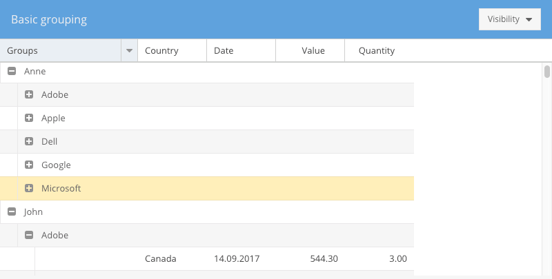
MultiGrouping feature
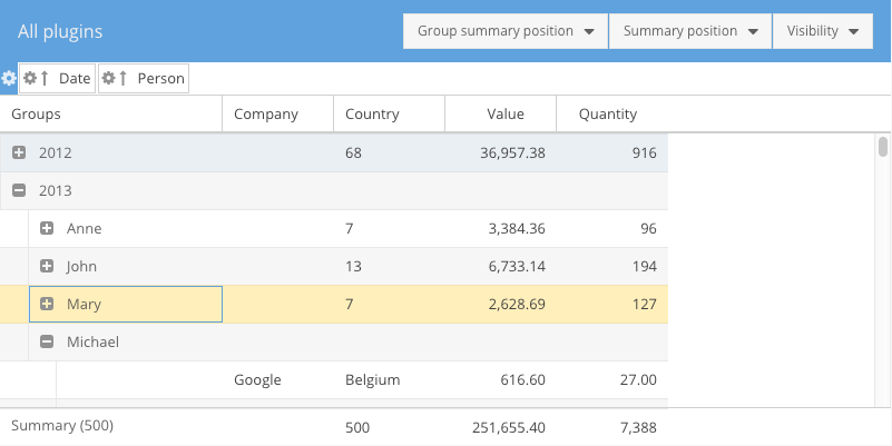
The MultiGrouping grid feature allows the Grid Panel to display the Store data that is grouped by multiple groupers. Here is an example of what it looks like:
And this is the class definition:
Ext.define('KitchenSink.grid.Grouped', {
    extend: 'Ext.grid.Panel',
    xtype: 'k-grouped',

    requires: [
        'KitchenSink.grid.GroupedController',
        'Ext.grid.feature.MultiGrouping'
    ],

    title: 'Basic grouping',
    controller: 'grouped',

    store: {
        type: 'sales',

        groupers: ['person', 'company']
    },

    columns: [
        { text: 'Company',  dataIndex: 'company', editor: 'textfield', groupable: true },
        { text: 'Country', dataIndex: 'country', editor: 'textfield', groupable: true },
        { text: 'Person', dataIndex: 'person', editor: 'textfield', groupable: true },
        { text: 'Date', dataIndex: 'date', xtype: 'datecolumn', format: 'd.m.Y' },
        { text: 'Value', dataIndex: 'value', xtype: 'numbercolumn', editor: 'numberfield', align: 'right' },
        { text: 'Quantity', dataIndex: 'quantity', xtype: 'numbercolumn', editor: 'numberfield', align: 'right' }
    ],

    features: [{
        ftype: 'multigrouping'
    }],

    // more configs
});
In the above example you can see that the grid store was configured with two groupers and some grid columns are configured with `groupable` config set to `true`. For the groupable columns, the header menu is enhanced to allow users to change the grouping on the fly:
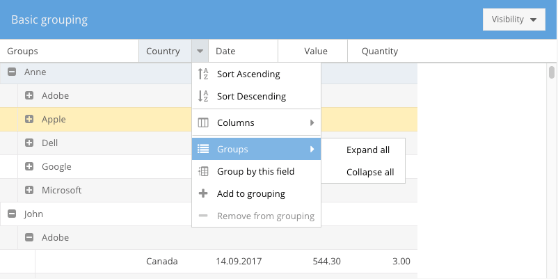
Users can either replace the grouping completely by choosing “Group by this field” or they can add that dimension to the existing grouping by choosing “Add to grouping”. There is also the possibility to expand or collapse all existing groups in the grid.
MultiGroupingSummary feature
Summaries should be defined on the Store model like this:
Ext.define('KitchenSink.model.Sale', {
    extend: 'KitchenSink.model.Base',

    requires: [
        'Ext.data.summary.*'
    ],

    fields: [
        {name: 'company',   type: 'string'},
        {name: 'country',   type: 'string', summary: 'count'},
        {name: 'person',    type: 'string'},
        {name: 'date',      type: 'date', dateFormat: 'c'},
        {name: 'value',     type: 'float', summary: 'sum'},
        {name: 'quantity',  type: 'float', summary: 'sum'},
        {
            name: 'year',
            calculate: function(data){
                return parseInt(Ext.Date.format(data.date, "Y"), 10);
            }
        },{
            name: 'month',
            calculate: function(data){
                return parseInt(Ext.Date.format(data.date, "m"), 10) - 1;
            }
        }
    ]
});

If you want to have summaries in the grid for all generated groups, then you can use this feature as follows:

Ext.define('KitchenSink.grid.Summary', {
    extend: 'Ext.grid.Panel',
    xtype: 'k-summary',

    requires: [
        'KitchenSink.grid.SummaryController',
        'Ext.grid.feature.MultiGroupingSummary'
    ],

    title: 'Grouping and summaries',
    controller: 'summary',

    store: {
        type: 'sales',

        groupers: ['person', 'company']
    },

    columns: [
        { text: 'Company',  dataIndex: 'company', editor: 'textfield', groupable: true },
        { text: 'Country', dataIndex: 'country', editor: 'textfield', groupable: true },
        { text: 'Person', dataIndex: 'person', editor: 'textfield', groupable: true },
        { text: 'Date', dataIndex: 'date', xtype: 'datecolumn', format: 'd.m.Y' },
        { text: 'Value', dataIndex: 'value', xtype: 'numbercolumn', editor: 'numberfield', align: 'right', summaryFormatter: 'number("0,000.00")' },
        { text: 'Quantity', dataIndex: 'quantity', xtype: 'numbercolumn', editor: 'numberfield', align: 'right', summaryFormatter: 'number("0,000")' }
    ],

    features: [{
        ftype: 'multigroupingsummary',
        groupSummaryPosition: 'bottom',
        summaryPosition: 'docked'
    }],

    // more configs
});
As you can see, you can set the position of both group summaries and grand summary and it will look like this:
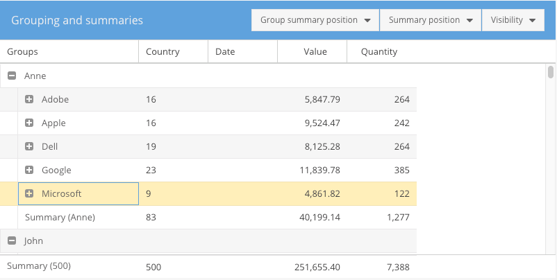
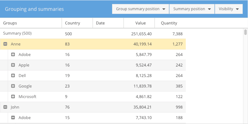
The group summaries can be displayed at the top or at the bottom of the group. The grand summary can either be the first in the grid, the last in the grid, or docked at the top or bottom of the grid.
GroupingPanel plugin
This plugin allows your end-users to drag and drop grid columns to the grouping panel section that is visible above the grid panel.
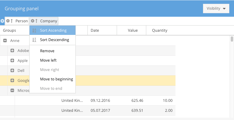
The user can move the dimensions in the grouping panel in which order he/she wants.
Ext.define('KitchenSink.plugin.GroupingPanel', {
    extend: 'Ext.grid.Panel',
    xtype: 'k-groupingpanel',

    requires: [
        'KitchenSink.plugin.GroupingPanelController',
        'Ext.grid.feature.MultiGrouping',
        'Ext.grid.plugin.GroupingPanel'
    ],

    features: [{
        ftype: 'multigrouping'
    }],

    plugins: {
        groupingpanel: true
    },

    // more configs
});
Summaries plugin
This plugin will enable your end-users to change the summary function on grid columns.
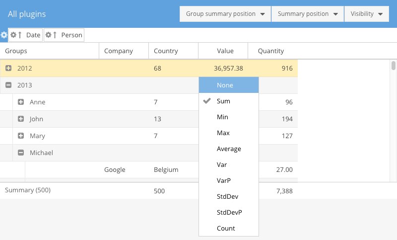
The summary functions that are available on a grid column are customizable. You need to provide a config to your grid column, as follows:
{
     xtype: 'column',
     summaries: {
         sum: true,
         average: true,
         count: false
     }
 }
If you want to have your own summary function used on that column then you need to configure it like this:
{
     xtype: 'column',
     summaries: {
         calculateSomething: true
     }
 }
And then implement a class for your own summary function, like this:
Ext.define('Ext.data.summary.CalculateSomething', {
     extend: 'Ext.data.summary.Base',
     alias: 'data.summary.calculateSomething',

     text: 'Calculate something',

     calculate: function (records, property, root, begin, end) {
         // do your own calculation here
     }
 });
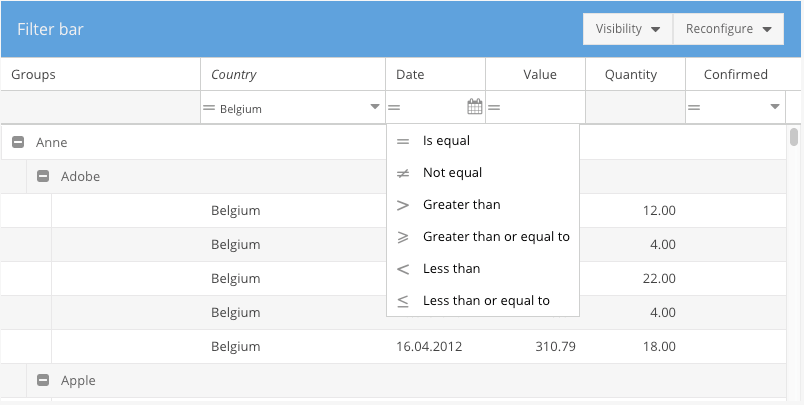
FilterBar plugin
This plugin will add a docked bar under the grid headers and depending on the grid columns configuration,filter fields will be added.
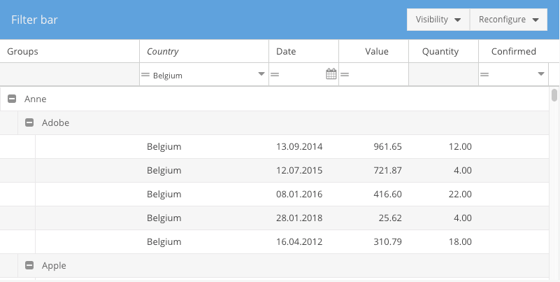
Each filter can be setup as you like and the available operators are also configurable.
Ext.define('KitchenSink.plugin.FilterBar', {
    extend: 'Ext.grid.Panel',
    xtype: 'k-filterbar',

    requires: [
        'KitchenSink.plugin.FilterBarController',
        'Ext.grid.plugin.FilterBar'
    ],

    title: 'Filter bar',
    controller: 'filterbar',

    store: {
        type: 'sales',

        groupers: ['person', 'company'],
        filters: [{
            property: 'country',
            operator: '==',
            value: 'Belgium'
        }]
    },

    columns: [
        { text: 'Company',  dataIndex: 'company', editor: 'textfield', groupable: true, flex: 1, filter: {type: 'string'} },
        { text: 'Country', dataIndex: 'country', editor: 'textfield', groupable: true, flex: 1, filter: {type: 'list'} },
        { text: 'Person', dataIndex: 'person', editor: 'textfield', groupable: true },
        { text: 'Date', dataIndex: 'date', xtype: 'datecolumn', format: 'd.m.Y', filter: {type: 'date'} },
        { text: 'Value', dataIndex: 'value', xtype: 'numbercolumn', editor: 'numberfield', align: 'right', filter: {type: 'number'} },
        { text: 'Quantity', dataIndex: 'quantity', xtype: 'numbercolumn', editor: 'numberfield', align: 'right' },
        { text: 'Confirmed', dataIndex: 'confirmed', xtype: 'booleancolumn', align: 'center', trueText: 'Yes', falseText: 'No', filter: {type: 'boolean'} }
    ],

    features: [{
        ftype: 'multigrouping'
    }],

    plugins: {
        gridfilterbar: true
    }

});
The following filter types are available: boolean, string, number, date, list and inlist. This list can be extended as you like by creating your own types that use your own fields.
Additional Resources
If you would like to learn more about mzSolutions and its commercial product GridPlugins, please follow these links:
Did you find the content helpful?
 0
0

 0
0

Latest Content

Introducing Rapid Ext JS: The Ultimate Low-Code Editor for Ext JS Development
We’re excited to announce the official release of Rapid Ext JS 1.0, a revolutionary low-code…
August 21, 2024

Sencha Architect 4.3.6 Has Arrived!
The Sencha team is pleased to announce the availability of Sencha Architect version 4.3.6. Building…
August 20, 2024

Introducing ReExt: A Game-Changer for React Developers
Sencha, a leader in JavaScript developer tools for building cross-platform and enterprise web applications, is…
August 20, 2024