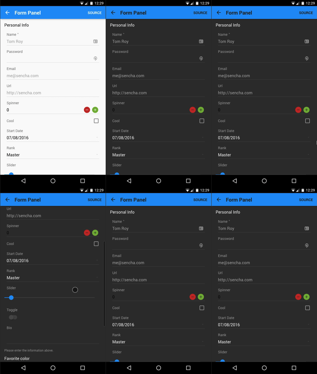
Materializing the Ext JS Modern Toolkit
Ext JS 6.2 introduces a brand new theme for the Modern Toolkit, based on Google’s Material Design. All components not only benefit from the look and feel, but gain the ability to change dynamically using our new, CSS variable-based, real-time theme updating capability.
Material Design has quickly gained popularity as a design foundation for many application developers. With a minimalistic look and bold colors that catch the eye, it makes for a memorable experience while still allowing for enough customization to make your applications feel personalized.
Although we generally refer to Material Design as a spec, it really feels like more of a recommended guide to help you keep consistency throughout your project. The guidelines cover a broad range of topics ranging from the look and feel to accessibility to feature discovery. All of which should be consulted as you build your application using the new Material Design Theme. You can find all the information you need at the Google Material Design website.
Our focus has been to keep a consistent design language for the Ext JS components, giving you an easy foundation to build off. While we plan to evolve and improve this theme over time, our first focus was on look and feel of the application. With this in mind, we decided to break down the key features of a Material Design application.
Bold Color Choices
One of the most unique features of the Material Design spec is its selection of colors. Unlike most themes that provide a small color palette, Material Design provides a large collection of colors to choose from. You can find these colors on the Material Design color palette page. These colors are not algorithmic but hand-chosen by designers to have harmony with each other and fit the bold spirit of Material Design.
Every color is referenced by a common name (red, green, blue, etc.) but also has been given a weight. Much like a font can be thin, normal, or bold, Material colors can be 100, 500, 900, etc. This helps produce a large palette of colors that can be used to help convey the importance of an item or simply help accent your application while keeping a consistent look.
The Ext JS Material Design Theme provides a function, material-color, to allow you to quickly access any color at any weight without having to look this up or use hex numbers. Following the spec, we are using 500, 300, and 700 as our base, light, and dark color weights, respectively.
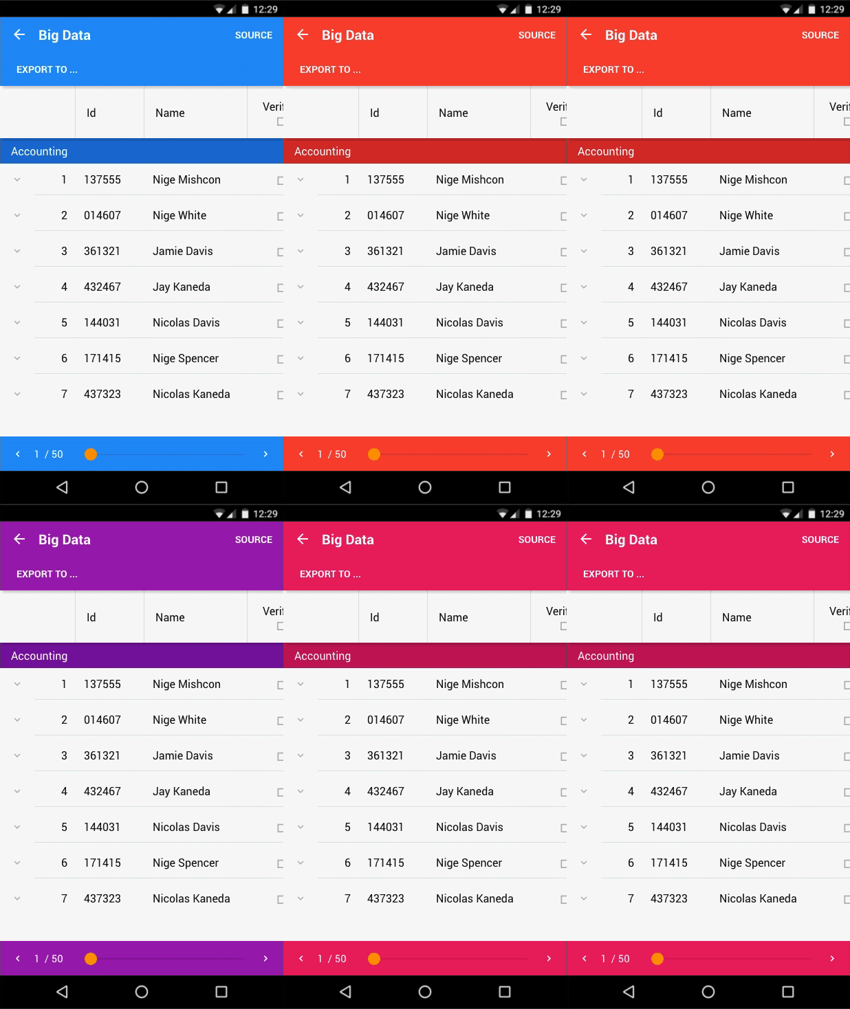
Customizing the color of your Ext JS application is very simple. Just set a $base-color-name and an $accent-color-name, and we will do the rest. Color combinations are then created based on the guideline, and components will respect these colors in your application. If you are looking for more control, don’t worry, we have you covered there as well. The theme exposes variables for every color we use, and after setting your base and accent one can easily fine tune anything from the lighter version of an accent color to the exact color a button uses for its text.
Spacing and Padding
Material Design uses white space and padding to convey separation of concerns. Occasionally, you will see thin rule lines but generally organization is accomplished by spacing your text or imagery.
The guide uses an 8dp baseline grid in which all components align. Generally, you will see padding of 16dp throughout the theme.
Shadows and Depth
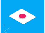
At its core, Material Design treats layers like paper. It conveys depths by casting shadows from one layer to another. When the elevation is small, the shadow will be minor. But when stacked higher, these shadows grow. Ext JS provides the material-shadow mixin to help create shadows at different elevations—although this should be used with caution. Adding unmotivated shadows is confusing to users and is only recommended when there is an understandable reason for why something should be on top.
Typography
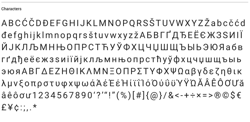
Material Design uses Roboto as its core font, and the guide specifies a small set of sizes, line heights, and weights. The benefit of a set of font styles like this is that it’s very easy to reuse a style in various places. As a result, your application feels much more organized and planned, rather than trying to handle font styles everywhere you need to use them. The Ext JS Material Design Theme provides the material-font-style function allowing you to set the size, weight, and line height easily.
User Interactivity
Ripples are an important part of the animation language for Material Design. A ripple is not just a cool looking animation. It provides feedback on where the user has interacted with something.
Any time a user interacts with a button, a ripple will be created from the point in which they touched or clicked. This not only provides feedback that the button has been pressed, but because the ripple is at the point of contact with the user, the application feels more connected to reality.
A Truly Dynamic Theme
In Ext JS 6.2, CSS variables are first-class citizens. Our core theme, Neptune, has been overhauled and provides this functionality to all themes that extend it. The Ext JS Material Design Theme is the first theme to truly use the power of CSS variables and Fashion to allow for an instant update to your application’s theme. Updating the Material Design Theme can be as simple as changing the base color at runtime. CSS variables are very powerful but are still limited in scope. This is where Fashion comes in to provide dynamic variable recalculation. Simply change your $base-color-name and Fashion will handle recalculations and set the proper CSS variables.
For more information on changing CSS variables with Fashion, check out the Fashion Documentation.
Dark Mode
Another great feature of the Ext JS Material Design Theme is its ability to seamlessly change into dark mode. Dark Mode maintains all your base and accent color combinations but affects background and text colors.
This customization is not only available during build time but also at runtime via CSS variable dark-mode. This allows you to provide runtime customization for your users to choose the look and feel they like best.
Browser Support
The Ext JS Material Design Theme has the same browser support as the Modern Toolkit. Most modern browsers support CSS Variables, but Sencha Cmd will take care of adding CSS variable fallbacks so your application will still work.
Conclusion
The Ext JS Material Design Theme will help you modernize your application — giving it a fresh new look, bold colors, and easy color palette customization. Trying the new theme is a simple app.json edit:
“theme”: “theme-mountainview”,
“theme”: “theme-material”,
Or you can explore the Material Design Theme online in the Ext JS Kitchen Sink example.
We’re excited to announce the official release of Rapid Ext JS 1.0, a revolutionary low-code…
The Sencha team is pleased to announce the availability of Sencha Architect version 4.3.6. Building…

Sencha, a leader in JavaScript developer tools for building cross-platform and enterprise web applications, is…


