Optimizing Your Ext JS Apps for Touch and Tablets
 Woop there it is — Ext JS 5. Now, you might wonder why you should upgrade. There are many reasons why you’ll want to upgrade your existing Ext JS 4 applications, but most important is optimizing your application to support touch and tablet devices.
Right now, everybody is used to running their applications on “mobile” devices. We live in a multi-device world. I read most of my email on my phone. Usually when I have to read a PDF or browse to a website, I use my tablet. I don’t even print documents anymore because I have a tablet. Going mobile is extremely important. This is why a lot of enterprises want to have their apps work on a touch device too.
Sure, you can run any website or web app on your iPad, so your existing Ext JS 4 application might run fine. But often, it behaves strangely or looks funky. That’s because it’s not optimized for touch support.
To learn more, join us for our upcoming webinar.
Optimizing Your Current Ext JS Apps for Touch and Tablets

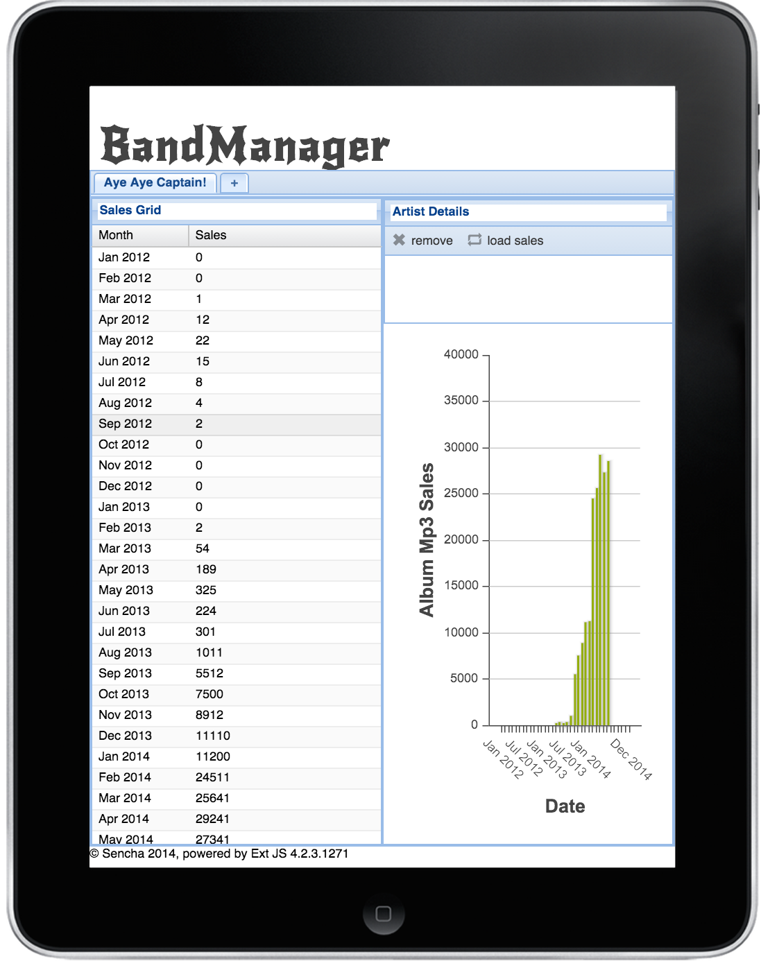
Let’s take a look at the next screenshot — the app is running on an iPad Retina. Obviously, it doesn’t look right, there’s not enough space for the chart. The grid rows are too small, and there’s no white space around the buttons. I could easily tap the wrong button with my fingers.
Also, tablets don’t support the features that were designed for use with a mouse and keyboard, such as right mouse click, hover states, etc.
MC Hammer would say: “U can’t touch this!”.
That’s why you need to optimize for touch. Because Ext JS 5 is an HTML5-based framework, we can optimize our apps by upgrading to Ext JS 5. But what about Sencha Touch — the other “mobile” framework.

The Difference Between Sencha Touch and Ext JS
Sencha Touch is a lightweight framework, specifically designed to support phones. It ships with all these device-specific themes (for iOS, Android, Tizen, Blackberry and Windows Phone). Sencha Touch also has a platform switcher, and it can run in offline mode.
You may wonder: if I can use Sencha Touch for tablets, why would I use Ext JS 5 instead?
Ext JS 5 also has support for mouse and keyboard, so you can run your apps on desktop and touch devices. Ext JS 5 continues to support Internet Explorer 8 and 9. It has many components and the architecture was developed to support large data sets. When you need to build large enterprise applications, Ext JS 5 should be your first choice. Also, when you already have an existing Ext JS 4 application, it’s much easier to upgrade to Ext JS 5 (and also better to maintain), than writing another Sencha Touch app.
Stop! Hammer Time!
Let’s break it down, and review all the features and components that ship with Ext JS 5, and what you can use to create touch applications.
- New Event System & Touch Gestures
- Touch Themes
- Responsive Config
- Touch Components
Event System & Touch Gestures
The Ext JS 5 event system makes a significant paradigm shift from previous releases by moving away from directly attached DOM listeners to a delegated event model (first implemented by Sencha Touch). The advantages are that it reduces the number of interactions with the DOM which can, especially on older browsers, be quite expensive. Also, it enables Touch Gestures, such as: swipe, pinch and rotate.
This means that for each type of event (mousedown, touchstart, etc.) a single listener is attached at the very top of the DOM hierarchy (the window object). When a DOM element fires an event, it bubbles all the way to the top before it is handled.
So we have an event system, which works out of the box; what else can we do for easy touch optimization? Well, Ext JS 5 has new touch optimized themes you can directly use in your apps.
Touch Themes
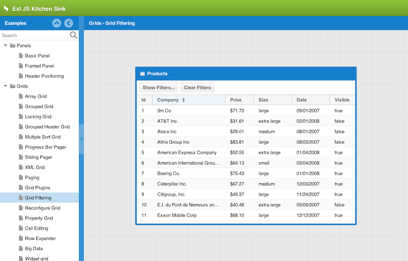
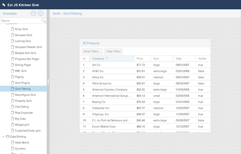
Ext JS 5 ships with new themes that are designed for touch devices. Buttons, components and icons are bigger and include more white space to make sure you won’t mis-tap an item.
Take a look at the next screenshots.
The Neptune Touch theme is highly customizable. This theme takes the modern and minimalistic look and feel of Neptune and adapts it for use in touch-centric contexts by increasing the size of some tappable elements to make the theme more touch friendly.
The Crisp Touch theme takes Neptune Touch and modifies the default colors, icons, etc., while keeping the same touch-friendly, iOS-like dimensions.
You can switch between themes by adding the theme property to myapp/app.json:
Although technically, you are running a touch-optimized app now, it still might not feel exactly right. That’s because optimizing for tablets also requires that you wear your designer hat. Sencha gives you all the tools, but you might need to re-think and re-design some parts of your existing app.
For example, on your desktop you can layout components next to each other, but on a tablet you might want to dock components underneath each other; maybe there are even components you would like to hide. You can do this with the responsive design feature in Ext JS.
Responsive Design
With the release of Ext JS 5, Sencha supports responsive design. To implement responsive design, you don’t need to code media queries in your CSS, you can write Sencha configurations, just like you’re used to:
responsiveConfig: {
portrait: {
dock: ‘bottom’
},
landscape: {
dock: ‘right’
}
}
For more info, see also:
http://docs.sencha.com/extjs/5.0.0/apidocs/#!/api/Ext.plugin.Responsive

Apart from responsive design, you might also need to review your current view components. By upgrading to Ext JS 5, all current components would be optimized for touch support. For example, the grid would behave perfectly on a tablet. A long press on a grid header would show the sorting dropdown. But you may also want to change certain components.
Touch Components > Forms
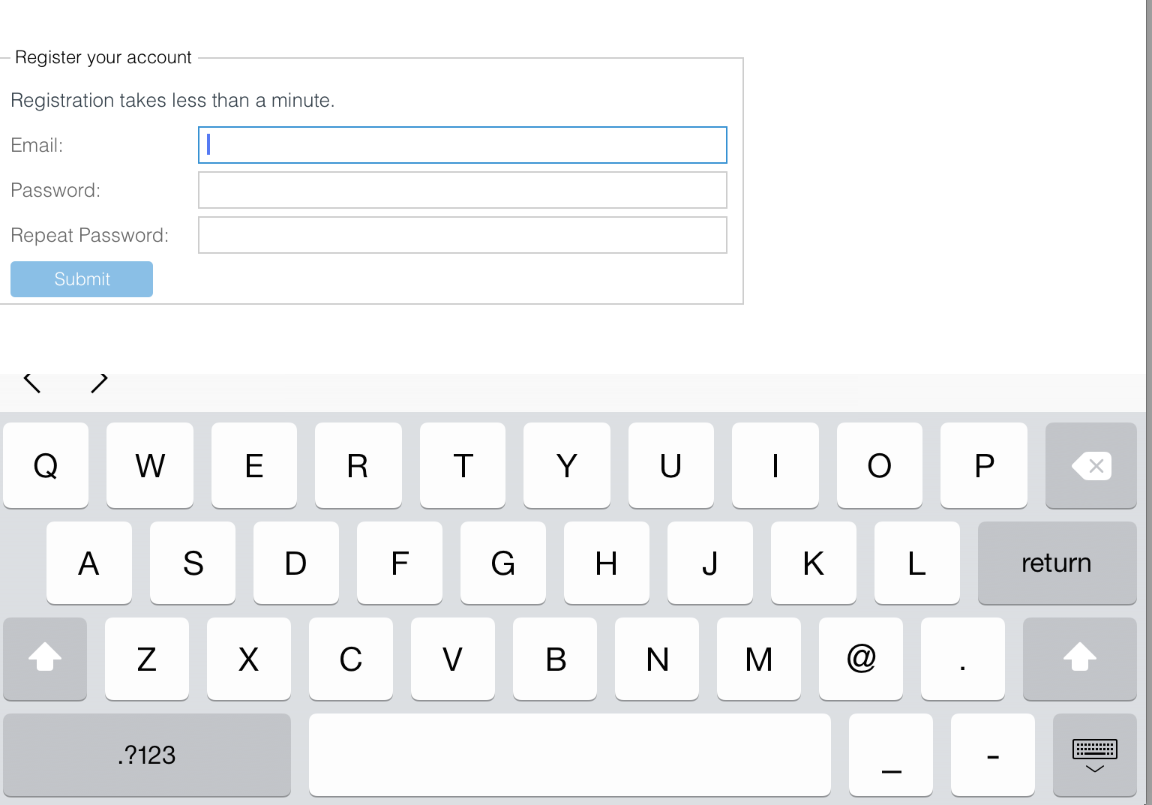
Ext JS 5 uses the HTML5 doctype. Therefore, we can use HTML5 forms and set form types. Such a form type can force a particular device to display the correct keyboard. Such as email, search, file, url, number, datetime, etc.
Here’s an example of how to set form types in Ext JS:
xtype: ‘textfield’,
inputType: ’email’,
name: ’email’,
fieldLabel: ‘Email’
}
On an iPad, it will display the keyboard used for email addresses — note the @ key.
Touch Components > Tabs
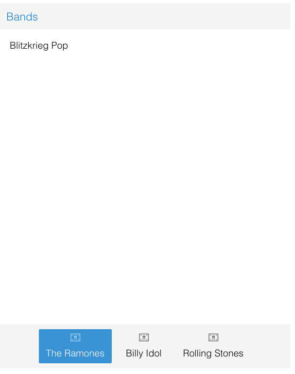
In Sencha Touch, you could position the Ext.tab.Panel at the bottom of your screen, center aligned with an icon — a common design choice for tablet interfaces. Now, in Ext JS 5, the Ext.tab.Panel can be configured like that too:
title : ‘Bands’,
renderTo : Ext.getBody(),
height : 500,
width: 400,
layout : ‘hbox’,
tabBar: {
layout: {
pack: ‘center’
}
},
tabPosition: ‘bottom’,
defaults: {
iconAlign: ‘top’,
bodyPadding: 15
},
items : [{
title: ‘The Ramones’,
glyph: ‘117@Pictos’,
html: ‘Blitzkrieg Pop’
}, {
title: ‘Billy Idol’,
glyph: ‘117@Pictos’,
html: ‘White Wedding’,
}, {
title: ‘Rolling Stones’,
glyph: ‘117@Pictos’,
html: ‘Paint it, Black’
}]
});
Touch Components > Charts
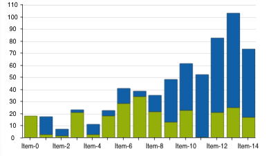
Chart components can use the same chart package as the one in Sencha Touch. These charts are SVG- or HTML5 Canvas-based, and can deliver better performance on mobile devices. This enhanced charting package brings many new features to Ext JS 5, including:
- Pan, zoom and crosshair interactions
- Candlestick and OHLC series
- Floating axes
- Multiple axes
- Greater customization
Touch Charts are not included in the framework, but they are available in a separate package. Therefore, to use them, you’ll need to enable the package:
“sencha-charts” // ext/packages/sencha-charts
]
Please note when using the new charting package, some of the chart syntax has changed. It’s best to look at the Charts API docs or guides for more info.
Conclusion
There are many more tricks that Ext JS 5 can offer that would work perfectly in the multi-device world. Device and feature checking, offline proxies…and more. You can start playing with this right now and test it on your touch device.
If you’d like to learn more about upgrading to Ext JS 5 and optimizing your existing apps for tablets, take our course: Upgrade to Ext JS 5 & Optimize for Tablets. Check out our course listings to sign up for one of our classes — online, on-site or at worldwide locations.

We’re excited to announce the official release of Rapid Ext JS 1.0, a revolutionary low-code…
The Sencha team is pleased to announce the availability of Sencha Architect version 4.3.6. Building…

Sencha, a leader in JavaScript developer tools for building cross-platform and enterprise web applications, is…


