

 Rapid Ext JS
 ReExt
ReExt


Training Tip: Developing Apps in a Multi-Device World
August 5, 2014
195 Views
I work for Sencha as a technical trainer, which means I travel a lot. Whenever I go through security at the airport, I have to pull out all my electronics. I’m always so amazed how many devices I have with me — a laptop, a tablet, an e-reader, my portable game console, a smartwatch, maybe my camera and of course my phone. Be honest, how many devices do you have with you right now while you’re reading this article — 3? 4? 5 or more?
We live in a multi-device world. You all have the same devices I do. Others have cars with smart navigation systems. All these devices have screens and often an internet connection. They come in different flavors — but they all run apps.
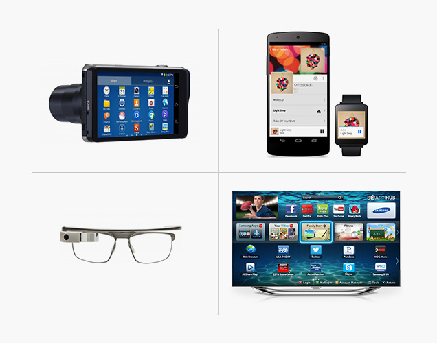
As you think about developing apps, which of these different devices will you target? Will you develop a native app for every device? That’s gonna be a pain to maintain, and it will cost a lot. So ideally, you would like to build a single app that runs on every device. To do this, you will have to look at the differences between all these devices.
Various Screen Sizes

The first thing you probably noticed is the screen size. Looking back, the days when I developed websites for 800×600 and 1024×768 are over. Nowadays, there are so many different resolutions that you can’t keep track of them all. Different devices have more or less space available on the screen, so it makes sense to design your application differently.
Think about an email application that runs on your phone and only displays a list. When you tap on an email subject, it displays the email. Now, when you run this app on a tablet, suddenly the list with emails is docked to the left, and all the email bodies are always visible in the center of your screen — simply because there is more space available.
One solution for building interfaces like these is responsive design. With techniques like CSS3 media queries, flexible grids, images and relative units, you can have a website respond to the user’s screen size.
With the release of Ext JS 5, Sencha supports responsive design. To implement responsive design, you don’t need to code media queries in your CSS, you can write Sencha configurations, just like you’re used to:
responsiveConfig: {
wide: {
height: 100
},
tall: {
height: 20
}
}
See more information in the Sencha docs.
In Sencha Touch, we deal with various screen sizes by creating device profiles. Device Profiles are great because not only can you create different views per device, you can also create different functionality:
extend: ‘Ext.app.Profile’,
config: {
name: ‘Tablet’,
views: [‘Main’]
},
isActive: function() {
return Ext.os.is(‘Tablet’);
}
});
See more information in the Sencha docs.
Different Operating System, Different Browser
Assuming all these devices can run a browser, another big difference across platforms is the operating system and the browser engine. Windows, Linux, Android, Mac OS X, iOS use different browser engines: Webkit (Safari, Google Chrome), Trident (Internet Explorer), Gecko (Firefox) or others.
Often, websites and web applications look and behave differently on each browser or browser and OS combination. This is why you need to test your application on multiple devices. Or, you can use a framework, such as Ext JS 5 or Sencha Touch. A good framework can make a developer’s life easier. We can focus on the things we love like implementing our business logic and creating app ideas. We let the framework deal with all the challenges and pitfalls of app development for different browsers on different platforms.
User Input
All these devices vary in the types of user input they support. Does your device support touch and gesture input? Mouse and keyboard? Maybe you run your app on a device with a stylus? Your smart TV app might require a remote control. Or maybe you want to go totally overboard and create Minority Report / Xbox Kinect like gestures? For example, you could develop an app in JavaScript and implement support for the Leap Motion Controller by using their APIs. See this article for details: Using the Leap Motion Controller with Sencha Touch.
Ext JS 5 and Sencha Touch have built-in touch and gesture support. You can use: tap, drag, swipe, pinch and rotate. But you do need to think about the best way to implement them. Double click and hover events might work best on a desktop computer. Swipe and pinch gestures work best on touch devices. Your buttons might need to be bigger and have more white space on touch devices. You’ll need to wear your designer hat and think about the best UI.
Features Sets
All these devices come with different feature sets. Obviously, your camera can take pictures or videos. Your TV has a cable connection or could record live TV. But there is more, on what type of internet connection are you running? Is your device location-aware using GPS? How much data can you store?
You also need to know whether there are APIs available for your device. For example, on phones and tablets, you might want to port your Ext JS 5 or Sencha Touch app with Adobe PhoneGap or Apache Cordova to build a hybrid app. By adding a native wrapper, you can get access to various device APIs. Think about the phone camera, calendar, contacts or push notifications.
There are lots of great Cordova plugins available. You could use a QR code reader plugin, or you could port your application to Google Glass? See this article for more details: Developing for Google Glass with Sencha Touch.
To create a hybrid build, you can use Sencha Cmd, in combination with Adobe PhoneGap or Apache Cordova on top of Node JS. Sencha has built-in integration, so you can use commands like these on your command line:
//for initializing Phonegap:
sencha phonegap init com.sencha.myapp MyApp
//for initializing Cordova:
sencha cordova init com.sencha.myapp MyApp
//..and then, build!
sencha app build native
Data Security
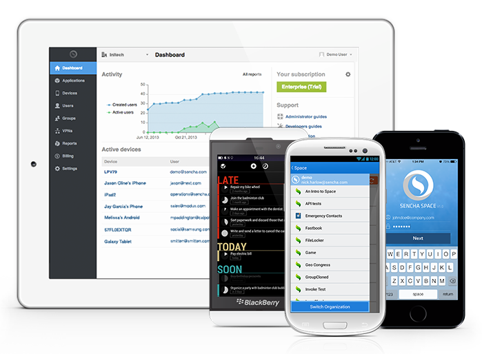
The last multi-device development challenge I would like to discuss is data security. Where do you save your data and is it secure?
With HTML5 browser capabilities like cookies, local storage, local databases and app cache, the browser may contain sensitive data, such as login information, website or purchase history, or data from your email client or CRM. It’s important to protect this data, so you don’t have to worry if your device is lost or stolen.
You can easily deploy your apps in Sencha Space, which provides a secure delivery platform. When a device is lost or stolen, it’s possible to remotely revoke user/device access or wipe the data. You can monitor, audit and report on app, device and user activity and all apps deployed within Sencha Space can communicate with each other.
Conclusion
Differences in platforms, screen sizes, user input and feature sets can make it hard to build a good looking and performing cross platform app. HTML5 is the language that every modern device understands. With Sencha Touch, Ext JS and Space, you have everything you need to build apps for multiple devices.
Do you already have an Ext JS 4 application that you’d like to optimize for “mobile” use? Sencha is offering Ext JS 5 courses online and in Europe and the US. Take a look at the training schedule and sign up for a class. You can get 10% off upcoming Ext JS 5 training classes — use the code: TrainingTip.
Did you find the content helpful?
 0
0

 0
0

Latest Content

Ext JS 7.8 Has Arrived!
The Sencha team is pleased to announce the latest Ext JS version 7.8 release. Following…
May 13, 2024
React Apps Development Using ReExt with Ext JS Components
The world is moving fast towards online businesses. Businesses are established online via social media,…
May 1, 2024

How to Write Unit Tests with Sencha Test
In modern software development, unit testing has become an essential practice to ensure the quality…
April 19, 2024