

 Rapid Ext JS
 ReExt
ReExt


Top Support Tips
October 20, 2016
191 Views
How to Create Different Builds and Switch Between Them in Your Ext JS Apps
by Alex Volfson
One reason you might want to have multiple builds is to create one app with different purposes. For instance, one of the simplest reasons to create multiple builds is for localization. Another use could be to allow the user to switch themes. Basically, anything in your app.json that can be modified can be split out into a different build.
For this example, I will show you how to swap themes. Unless you initially created your app as a universal app, you will have to make some changes to your app.json, so it can handle multiple builds. See changes below:
"bootstrap": {
        "base": "${app.dir}",
        "manifest": "${build.id}.json",
        "microloader": "bootstrap.js",
        "css": "bootstrap.css"
    },
"output": {
        "base": "${workspace.build.dir}/${build.environment}/${app.name}",
        "manifest": "${build.id}.json",
        "js": "${build.id}/app.js",
        "appCache": {
            "enable": false
        },
        "resources": {
            "path": "${build.id}/resources",
            "shared": "resources"
        }
    },
"cache": {
        "enable": false,
        "deltas": "${build.id}/deltas"
    },
"resources": [
        {
            "path": "resources",
            "output": "shared"
        },
        {
            "path": "${toolkit.name}/resources"
        },
        {
            "path": "${build.id}/resources"
        }
    ],
 "archivePath": "archive/${build.id}"
Notice that there are now build IDs.
In index.html, you should add the code that allows you to swap builds:
Note that you can use any logic to determine which build will get loaded. Here, we are just checking the querystring. To change builds in your app, you would just redirect the user to the proper url.
Finally, in your app.json, define how your builds are different:
"builds": {
        "classic": {
            "toolkit": "classic",
            "theme": "theme-first-classic"
        },

        "classic2es": {
            "toolkit": "classic",
            "theme": "theme-second-classic", //your other theme!
            "locale": "es"
        }
  }
The build names are arbitrary (classic and classic2) but this is what you will use to match the build profile in your index.html JavaScript. For this example, I chose to change the themes and locale for the builds. Remember, you can change any property available to you in app.json for each build (such as requires, overrides, etc).
Using the childEls for a Quick Reference of Elements in Your Component
by Gil Lopes
If you’re writing your own component and it has some internal elements, you may want to have a quick reference to these elements instead of having to query for them by using some code like: component.query(‘elementFoo’).setStyle(‘color: white;’);
Our childEls config comes in handy in this situation. This config is usually used along with the id and data-ref element tags. For example, let’s create an element:
{title}
Note: When we place the variable {id} in an element that is part of an Ext JS component, it will retrieve the component’s id.
If this element was placed inside the component, and we wanted to get a reference to it, all we’d need to do is add the following config:
childEls: ['title']
This is a complete code example:
var cp = Ext.create('Ext.Component', {
renderTo: document.body,
renderTpl: [
'{title}
',
'{msg}
',
],
renderData: {
title: 'Log',
msg: 'App has been loaded'
},
childEls: ['title', 'msg']
});
cp.msg.setStyle({
backgroundColor: 'black',
color: 'white'
});
Notice that because this element was created by childEls, once we reference it using component.element, we’ll get an instance of Ext.dom.Element, and we’ll be able to use all of its methods, which is much better than using:
Ext.fly(ct.el.dom.querySelector('p[data-ref=msg]')).setStyle({
    backgroundColor: 'black',
    color: 'white'
});
Check out this Fiddle.
Theme Your Apps with Sencha Themer
by Kevin Jackson
Sencha Themer is life changing! Well, maybe not your whole life, but certainly the part involved with theming an Ext JS application. Sencha Themer provides simple and intuitive tools that help you create compelling themes quickly. Here are a few tips to get you started.
Inspect is Your Friend
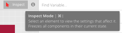
Use inspect at the top right of the program. This allows you to drill down to exactly the right component variable. You will likely be able to use this for the majority of your styling needs.
Adding Google Fonts
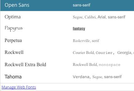
When you select a font, you’ll have access to all the available fonts on your system and a link to the following screen. I’ve selected a font from the Google site and also added Fallback choices.
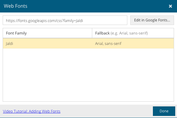
Using Google Fonts is far more straightforward than it has ever been.
Pay Attention to the Interface
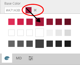
When picking a color, Themer displays a color palette that automatically contains the base color, background color, and font color. Because I changed the base color, that row changed to reflect it, and there is also an X next to the Color Picker to indicate I have changed it. Clicking it would revert to the original base color. The colors to the left and right of the center color are tints in 5 degree increments. These are often perfect choices for highlights, over states, etc. You can add additional colors to the palette using the material design (MD) or color selector tabs.
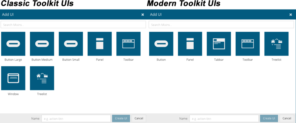
Create Custom UIs
Currently, there are several UI options available for Custom UIs in Classic and Modern toolkits. These are both available when using Ext JS 6.2 GA.
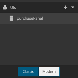
“purchasePanel” in this screen capture indicates that I have created a custom UI for a Purchase Panel that would be used only for those situations. You click on the + and then choose the appropriate component for your needs. From there, you can theme just as you would any other component. The difference here is that it is not global, it is targeted.
You can theme the Modern and Classic toolkits in Ext JS 6.2 GA. The selectors are in the bottom left of the program interface.
In the End, It’s All About Variables
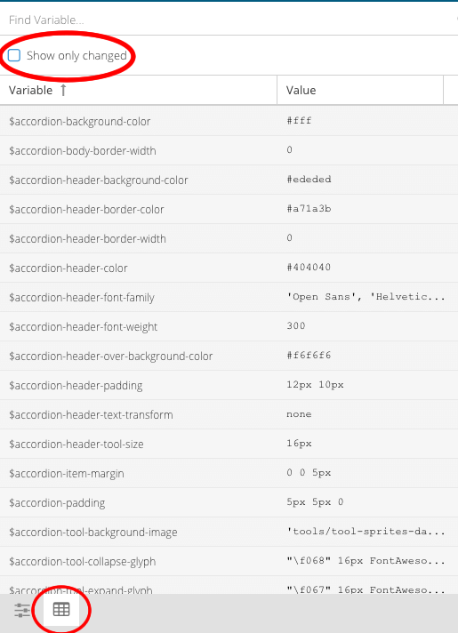
Often you may want to see how all of your theming changes have altered your code. On the bottom right of the interface (the screenshot is zoomed in on that section), select the highlighted button. At the top, you can choose to see all variables or just those changed. Behind the scenes, all of your changes are being kept in a file called save.scss that will be compiled into your final code and will give you optimized CSS for your application.
Theming With Your Corporate Colors
Use a color selector that makes it easy to grab colors directly from your logo for branding. Based on my past experiences, I use Color CC from Adobe. It’s free, intuitive, and lets you immediately glean the values that you can use for styling. You upload your company logo, choose from a number of presets, and the app will automatically select colors for you, or you can select them manually. Any color will be an exact match to your corporate standard and in seconds you can create multiple color schemes pulled directly from your corporate brand. These values can then be easily brought into Sencha Themer.
Did you find the content helpful?
 0
0

 0
0

Latest Content

Ext JS 7.8 Has Arrived!
The Sencha team is pleased to announce the latest Ext JS version 7.8 release. Following…
May 13, 2024

React Apps Development Using ReExt with Ext JS Components
The world is moving fast towards online businesses. Businesses are established online via social media,…
May 1, 2024

How to Write Unit Tests with Sencha Test
In modern software development, unit testing has become an essential practice to ensure the quality…
April 19, 2024