Expressive Presentation of Data with Sencha GXT 3 Charts
July 5, 2012
134 Views
In a previous article, we provided an introduction to the Sencha GXT 3 charting library. However, there is far more to the charting library than was previously covered. This article discusses the more intermediate and advanced features that you can use — including tweaking the data store backing your chart. With some simple changes to the basic chart setup, you can make your visualizations even more explanatory and expressive.
### Store Filter
Filtering is one of the more powerful tools of the store API. Store data can be filtered without having to remove it. Here is an example of a scatter chart with a large number of points.

It would be useful to let the user focus on a specific range of points. This can easily be done using filters.
First, be sure to enable filters on your store.
store.setEnableFilters(true);
Then, for example, you might want to display only data ranging from 0 to 50 in the first field.
store.addFilter(new StoreFilter<Data>() {
    @Override
    public boolean select(Store<Data> store, Data parent, Data item) {
    double data1 = dataAccess.data1().getValue(item);
    if (data1 < 0 || data1 > 50) {
        return false;
    } else {
        return true;
    }
    }
});
The filter chart example does similar filtering based on the values in the spinner fields. Notice the series is removed when all store items are filtered out.
### Gaps in Data
Sometimes, the problem is not an overabundance of data in your store, but a lack thereof, such as when the data you are representing has gaps in its recording. In this case, the data lacks a value, so it is best for the point not to be rendered at all. Representing no value as zero can be misleading. LineSeries and ScatterSeries provide the ability to do this.

In the line gap chart example, data with gaps is simulated by storing Double.NaN every four items. Null values are also applicable for gaps in data.
for (int i = 0; i < 12; i++) {
    if (i % 4 != 0) {
    store.add(new GapData(monthsFull[i % 12], Math.random() * 100, Math.random() * 100));
    } else {
    store.add(new GapData(monthsFull[i % 12], Double.NaN, Double.NaN));
    }
}
The first series “Gapless” represents the default response where the line is still drawn over the point, but a marker is not drawn. The second series “Gapped” has the gapless flag set to false.
series2.setGapless(false);
This changes the line series to use a moveto command for the next point creating a more visible gap in the chart.
### Integration With GXT3
Another great feature of the chart store relationship is integration with other GXT data widgets. Here we have a more complex example, the dashboard example, which uses two charts in collaboration with a grid.
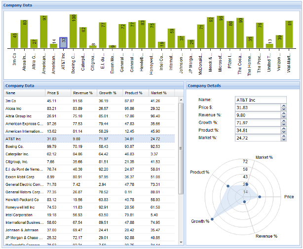
First, let’s take a look at the bar chart. It represents the overarching value and the price for each company. Because it uses the same store as the grid, this allows for easy cross widget selection. The following handler selects the appropriate grid item when a bar is selected.
bar.addSeriesSelectionHandler(new SeriesSelectionHandler<Data>() {
    @Override
    public void onSeriesSelection(SeriesSelectionEvent<Data> event) {
    grid.getSelectionModel().select(event.getIndex(), false);
    }
});
To the right of the grid, there are a set of widgets to display the finer details of the currently selected company. The radar chart is perfect for showing the relationship between the five properties of each company. You can do this by setting up the radar chart with a separate store that updates with the data that is currently in focus.
private void updateRadarStore(int index) {
    radarStore.clear();
    Data data = store.get(index);
    name.setValue(data.getName());
    radarStore.add(new RadarData(radarLabels[0], data.getData1()));
    price.setValue(data.getData1());
...
Also, notice the variable “price”. This is one of the spinner fields, which is used to manipulate the properties of the currently selected company. Each spinner field uses its value change event to update the store and the relevant chart.
price.addValueChangeHandler(new ValueChangeHandler<Double>() {
    @Override
    public void onValueChange(ValueChangeEvent<Double> event) {
    if (currentData != null) {
        Double value = event.getValue();
        if (value != null) {
        int storeIndex = store.indexOf(currentData);
        currentData.setData1(value);
        store.update(currentData);
        bar.drawSeries();
        bar.highlight(storeIndex);
        updateRadarStore(storeIndex);
        radarChart.redrawChart();
        }
    }
    }
});
Using the currently selected store item, it replaces the stored value and updates the store for that item. It then redraws the radar chart and the bar chart for the new data.
Now, looking at the core of the example, the grid, we see that both charts respond to changes in the grid. Because they use the same store, anything that alters the store on the grid also affects the bar chart, so sorting or filtering the grid causes the bar chart to respond in kind.

Also, when a grid row is selected, it saves the respective store item, highlights the appropriate bar and updates the company detail pane.
grid.getSelectionModel().addSelectionChangedHandler(new SelectionChangedHandler<Data>() {
    @Override
    public void onSelectionChanged(SelectionChangedEvent<Data> event) {
    if (event.getSelection().size() > 0) {
        int index = store.indexOf(event.getSelection().get(0));
        if (currentData != null) {
        bar.unHighlight(store.indexOf(currentData));
        currentData = null;
        }
        if (index >= 0) {
        bar.highlight(index);
        currentData = event.getSelection().get(0);
        // update radar chart
        updateRadarStore(index);
        radarChart.redrawChart();
        }
    }
    }
});
Hooking up these widgets makes for a more interactive and responsive application.
### ValueProvider
Finally, let’s take a look at an example of how to dynamically create line series beyond the initial number of value provider fields. All of the examples in this article use the property access method of generating value providers. However, that is not the only way to provide data fields to your charts. Value provider is simply an interface that allows you to get data from some other data.

In the dynamic line chart example, we avoid property access altogether and simply use a Map for our store items.
public class ModelItem extends HashMap<String, Double> {
    private String key;

    public ModelItem(String key) {
        this.key = key;
    }

    public String getKey() {
        return key;
    }
}

public class MapValueProvider implements ValueProvider<ModelItem, Double> {
    private String field;

    public MapValueProvider(String field) {
        this.field = field;
    }

    @Override
    public String getPath() {
        return field;
    }

    @Override
    public Double getValue(ModelItem object) {
        return object.get(field);
    }

    @Override
    public void setValue(ModelItem object, Double value) {
        object.put(field, value);
    }
}

...

ListStore<ModelItem> store = new ListStore<ModelItem>(new ModelKeyProvider<ModelItem>() {
    @Override
    public String getKey(ModelItem item) {
    return String.valueOf(item.getKey());
    }
});
This makes for a less readable but more dynamic value provider that can be created during run time; but first, the store needs to be initialized with the maps where the field data will be stored.
for (int i = 0; i < 12; i++) {
    ModelItem item = new ModelItem("item" + i);
    item.put("first", Math.random() * 100);
    store.add(item);
}
Then, let’s write a method to create a line series given an arbitrary field. Notice the new value provider is also added to the axis.
private LineSeries<ModelItem> createLine(String field) {
MapValueProvider valueProvider = new MapValueProvider(field);

LineSeries<ModelItem> series = new LineSeries<ModelItem>();
series.setYAxisPosition(Position.LEFT);
Color color = new RGB((int) (Math.random() * 255), (int) (Math.random() * 255), (int) (Math.random() * 255));
series.setStroke(color);
series.setYField(valueProvider);
Next, to make the first line using the data setup for the “first” field, we only need to call.
LineSeries<ModelItem> series = createLine("first");
chart.addSeries(series);
Now, when the user wants to add a new line in the example, we simply add new data to the maps in the store and create a new line with a value provider that accesses that data.
TextButton add = new TextButton("Add");
add.addSelectHandler(new SelectHandler() {
    @Override
    public void onSelect(SelectEvent event) {
        String field = fieldInput.getValue();
        if (field.length() > 0 && fieldStore.findModelWithKey(field) == null && fieldStore.size() < 10) {
            for (int i = 0; i < store.size(); i++) {
                ModelItem item = store.get(i);
                item.put(field, Math.random() * 100);
            }
            LineSeries<ModelItem> series = createLine(field);
            fieldStore.add(series);
            axis.addField(series.getYField());
            chart.addSeries(series);
            chart.redrawChart();
        }
    }
});
### Summary
In this article, you got to see some of the ways you can leverage the power of Sencha GXT 3 Charts to quickly and easily develop rich, informative visualizations for your web application. We’re proud of the set of tools we’ve made available as part of GXT, and we can’t wait to see the applications you build with them.
Did you find the content helpful?
 0
0

 0
0

Latest Content

Introducing Rapid Ext JS: The Ultimate Low-Code Editor for Ext JS Development
We’re excited to announce the official release of Rapid Ext JS 1.0, a revolutionary low-code…
August 21, 2024

Sencha Architect 4.3.6 Has Arrived!
The Sencha team is pleased to announce the availability of Sencha Architect version 4.3.6. Building…
August 20, 2024

Introducing ReExt: A Game-Changer for React Developers
Sencha, a leader in JavaScript developer tools for building cross-platform and enterprise web applications, is…
August 20, 2024