


Customizing GXT Grid for Data Centric Applications
March 23, 2016
183 Views
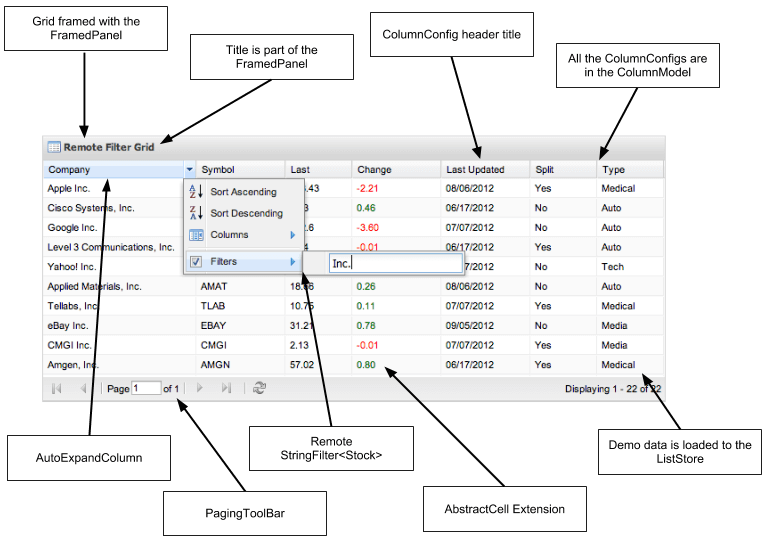
The GXT Grid is one of the most popular components for enterprise applications. It offers powerful built-in features including:
- local or remote filtering
- local or remote sorting
- column grouping
- a tree view (TreeGrid)
- paging and “infinite” scrolling
- editable cells
- extensible column header menus
In this article, we’ll look at three ways you can customize the Grid for typical enterprise use cases:
- Create a custom hyperlink cell
- Enable editing per row / per cell
- Extend column header menus
Create a Custom Hyperlink Cell
GXT provides numerous types of cells that can be used in a GXT Grid. All of these extend the GWT AbstractCell class, so they are interchangeable with GWT cell widgets. That is, you can use a GXT cell in a GWT CellTable or use a GWT cell in a GXT Grid.
One cell type that is not included in GWT nor GXT is a simple hyperlink cell which displays a clickable link based on some attribute of the underlying record. In this example, we’ll create such a cell. We’ll create an AnchorLinkCell that extends the GWT AbstractCell type and defines an AnchorListener interface that will be used to handle a click on the link. The result will look like this:
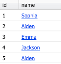
The name column uses our new AnchorLinkCell.
package com.example.project.client.customcell;
import com.google.gwt.cell.client.AbstractCell;
import com.google.gwt.cell.client.ValueUpdater;
import com.google.gwt.dom.client.Element;
import com.google.gwt.dom.client.NativeEvent;
import com.google.gwt.safehtml.shared.SafeHtmlBuilder;
import com.google.gwt.safehtml.shared.SafeHtmlUtils;
import com.sencha.gxt.core.client.ValueProvider;
/**
* Displays a hyperlink anchor in a cell and provides an interface
* to handle onClick.
*/
public class AnchorLinkCell extends AbstractCell {
public interface AnchorListener {
void onClick(T value);
}
private final ValueProvider vp;
private final AnchorListener listener;
public AnchorLinkCell(ValueProvider vp, AnchorListener listener) {
// consume click event
super("click");
this.listener = listener;
this.vp = vp;
}
@Override
public void render(com.google.gwt.cell.client.Cell.Context context, T obj, SafeHtmlBuilder sb) {
sb.appendHtmlConstant(""); }
@Override
public void onBrowserEvent(com.google.gwt.cell.client.Cell.Context context, Element parent, T value, NativeEvent event, ValueUpdater valueUpdater) {
super.onBrowserEvent(context, parent, value, event, valueUpdater);
if (parent.getFirstChildElement().isOrHasChild(Element.as(event.getEventTarget()))) {
listener.onClick(value);
}
}
}
The AnchorLinkCell constructor supplies a GXT ValueProvider that will be used to obtain the hyperlink text. In addition, it supplies the AnchorListener to handle clicks. The render() method creates a <div> containing an <a> element. For simplicity in this example, we’re using inline styles. The default hyperlink style gets overridden by the GXT reset.css, so we need to recreate the standard hyperlink appearance. The onBrowserEvent() is overridden to delegate all consumed events (in this case, only mouse clicks) to the ActionListener.
Now let’s look at how to wire up the AnchorLinkCell for a column. Let’s assume we already have an Employee class representing the model type of the data in the Grid and its corresponding PropertyAccess interface. To use the cell, we just need to create a ColumnConfig and set the cell type to our custom AnchorLinkCell:
        EmployeePropertyAccess epa = GWT.create(EmployeePropertyAccess.class);
        ...
        ColumnConfig nameCol = new ColumnConfig(epa.identity(), 100, "name");
        nameCol.setCell(new AnchorLinkCell(epa.name(), new AnchorListener() {
            @Override
            public void onClick(Employee emp) {
                Info.display("onClick", "You selected employee # " + emp.getId());
            }
        }));
      ...
Note the type parameters of the ColumnConfig. Both the column type parameter and cell type parameter are the model type, Employee. This ensures that the Employee record can be passed through all the way to the AnchorListener. In order for this to work, the ValueProvider type in the ColumnConfig constructor must be the IdentityProvider for the Employee class. If we wanted to supply more info to the AnchorLinkCell class, such as the Employee ID to be used in the hyperlink URL, we could alter the AnchorLinkCell constructor to receive the whole PropertyAccess interface instead of just a single ValueProvider.
Enable Editing by Row
The inline editing grid is a powerful GXT feature that allows you to click or double-click on a cell to edit the value in place. To enable editing, we create an instance of GridInlineEditing and then add an Editor to it for the specific column we want to enable:
        ColumnConfig notesCol = new ColumnConfig(epa.notes(), 100, "notes");
        final Grid grid = new Grid(listStore, columnModel);
        GridEditing editing = new GridInlineEditing(grid);
        editing.addEditor(notesCol, new TextField());
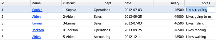
Click the notes column to edit in place.
This code above enables all cells in the notes column for inline editing. But what if we wanted to enable only select rows for editing? It turns out we can do this by overriding a method in the GridEditing class.
        ColumnConfig notesCol = new ColumnConfig(epa.notes(), 100, "notes");
        final Grid grid = new Grid(listStore, columnModel);
        GridEditing editing = new GridInlineEditing(grid) {
            // disable editing on select rows
            public void startEditing(Grid.GridCell cell) {
                editEmployee = getEditableGrid().getStore().get(cell.getRow());
                // Only names that start with S are editable
                if (editEmployee.getName().startsWith("S")) {
                    super.startEditing(cell);
                }
            };
        };
        editing.addEditor(notesCol, new TextField());
The startEditing() method gets invoked whenever the user clicks on an editable column. However, it must call super.startEditing() to actually begin editing the cell. We can use this to effectively disable editing for certain rows. In this case, editing for any row is enabled only if the employee name starts with “S.” We could also use the cell.getCol() property to obtain the column descriptor to decide whether to allow editing for a specific row and column.
Extend Column Header Menus
The third customization we’ll look at it is how to add items to a column header dropdown menu. Ordinarily, GXT builds the menu for you based on the Grid features such as sorting that you’ve enabled.

GXT-generated column header menu allows sorting, column selection.
To add a custom menu item to the column header context menu, we simply override the createContextMenu() method in the GridView class. In this example, we’ll add a custom action to the header menu for all columns:
// Custom header menu items
final Grid grid = new Grid(listStore, columnModel, new GridView() {
@Override
protected Menu createContextMenu(int colIndex) {
Menu menu = super.createContextMenu(colIndex);
menu.add(new MenuItem("custom1", new SelectionHandler
The result looks like this:
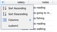
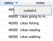
The new custom menu item appears after the built-in menu items.
In addition, if we want to completely replace the contents of the custom context menu, we can do this by simply replacing the call to super.createContextMenu():
...
protected Menu createContextMenu(int colIndex) {
Menu menu = new Menu();
menu.add(new MenuItem("custom1", new SelectionHandler
The result looks like this:
A custom menu can completely replace the built-in menu.
Conclusion
The Grid is a powerful and highly extensible component of GXT and one of the most popular in enterprise applications. By extending the powerful GridEditing and GridView classes, you can further customize the functionality to create rich web applications with powerful UIs.
Did you find the content helpful?
 0
0

 0
0

Latest Content

Introducing Rapid Ext JS: The Ultimate Low-Code Editor for Ext JS Development
We’re excited to announce the official release of Rapid Ext JS 1.0, a revolutionary low-code…
August 21, 2024

Sencha Architect 4.3.6 Has Arrived!
The Sencha team is pleased to announce the availability of Sencha Architect version 4.3.6. Building…
August 20, 2024

Introducing ReExt: A Game-Changer for React Developers
Sencha, a leader in JavaScript developer tools for building cross-platform and enterprise web applications, is…
August 20, 2024